Hiding columns after a media breakpoint doesn't resize the table properls
Hiding columns after a media breakpoint doesn't resize the table properls
 arminus
Posts: 2Questions: 1Answers: 0
arminus
Posts: 2Questions: 1Answers: 0
Debugger code (debug.datatables.net): ixumop
Description of problem: I have some code which removes a table column for mobile screens:
@media screen and (max-width: 768px) {
  .hide-on-mobile {
    display: none;
  }
}
and
  columnDefs: [
    {
      targets: [2],
      visible: true,
      className: "hide-on-mobile",
    },
  ]
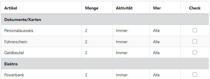
The problem is that up to that breakpoint, the table is sized properly, like so:
but once the column is removed by CSS, it isn't anymore:
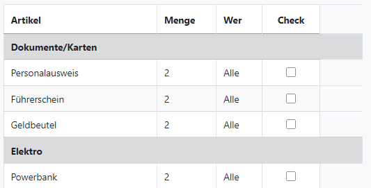
i.e. the row group headers scale to the full width, the column headers don't.
Any idea how this could be solved?
This question has an accepted answers - jump to answer
Answers
You could either use the "responsive" extension which automatically puts columns in child rows on smaller screens.
Or you use the api to hide columns and not CSS because Data Tables won't "know" about your CSS manipulations.
You could programmatically get the screen width
https://www.w3schools.com/js/js_window_screen.asp
and then hide or show the column using an event handler, e.g. "init" or "draw"
https://datatables.net/reference/api/column().visible()
https://datatables.net/reference/event/draw
https://datatables.net/reference/event/init
Thanks for the quick response!