Forced column hiding for inner/nested tables
Forced column hiding for inner/nested tables
 teemomr
Posts: 13Questions: 3Answers: 0
teemomr
Posts: 13Questions: 3Answers: 0
Hi,
In my application, I have nested tables which are designed like this: http://live.datatables.net/teleletu/1/edit
If a row is expanded (i.e the + button is clicked), the entire inner row shows irrespective of the outer table's size.
I'm not using the responsive library because, the behaviour showing the hidden col's info as a child row is not what I want. The inner tables in my application are independent of the parent row/outer table.
I've tried the following:
Add a forced visibility toggle to only show the first n rows where n is the total no. of visible rows. This works initially when adding the inner row, but it does not trigger on any other events like window resize etc.,
    var total_visible = outer_table.columns(':visible').count()-2;
    $('#'+table_id).find('table[id^=inner_]').each(function(index, elm) {
        var inner_table = $(elm).DataTable()
        for(var i = 0;i<inner_table.columns()[0].length;i++){
            if(i>total_visible){
                inner_table.column(i).visible( false );
            }else{
                inner_table.column(i).visible( true );
            }
        }
        $(elm).DataTable().columns.adjust().responsive.recalc()
    });
Right now, the outer table's columns are automatically hidden based on responsivePriority and it works perfectly. Is it possible to have the same behaviour for the nested table also?
I read several posts about this, but so far nothing was able to solve my issue. I also saw this post: https://datatables.net/forums/discussion/35963/problem-with-responsive-datatable-inside-a-html-table. From this, I understand that this is how tables work - i,e they are dependant on the window's size - is there a workaround/any other similar solutions for this? Using table-layout:fixed just adds a horizontal row inside which does not look good at all.
Answers
Yes, but you explicitly say that you aren't using Responsive for the inner table - so you'd need to write the code to do that.
I don't actually understand the problem you are trying to solve here? Do you want the inner table to be responsive? But you said you don't want to use Responsive on it? What about it don't you want on the inner table?
Allan
@allan
My table element also does NOT have the
responsiveclass. I tried to replicate the table I have in my application as much as possible here in the sample code: http://live.datatables.net/teleletu/5/editBut in the sample above, I'm not able to get the behavior I noticed in my application (i.e, a button is added automatically as the first column and clicking it shows the hidden columns of the main table in a list order).
I also tried using responsive (
responsive: true) explicitly for inner table alone, but that too did not work - both in my application and in the sample code attached above.So, I do have the responsive datatables files (js and css) as imports, but I'm not explicitly using them by the option
responsive: true. I've set that option to false.I also tried changing a lot of other datatable initialization parameters, but nothing changed this behavior.
This is how it looks if I turn on responsive in my application: (same buttons and same format as in the sample code above)
When expanded, it looks like this:

which is basically showing the hidden column's values. just as explained here: https://datatables.net/extensions/responsive/examples/column-control/auto.html
What I do want is: only hiding of columns (which already works and happens in my application's main table when the window size is sufficiently small) for inner table just like it works for main table.
My comment got deleted...
sigh.... typing again....
I've tried to replicate as much of my application's code here: http://live.datatables.net/teleletu/5/edit
But in the test code above, I'm not able to observe the auto-hide-columnas-as-childrow behavior. I'm not sure why. I also checked my application's table class list - it does NOT have
responsiveclass.I do have datatables responsive code's js and css files as imports, but in my table options, I have 'responsive:false' for both outer and inner rows because I don't want the behavior explained above.
Here's what I see in my application's main table when I turn ON responsive:

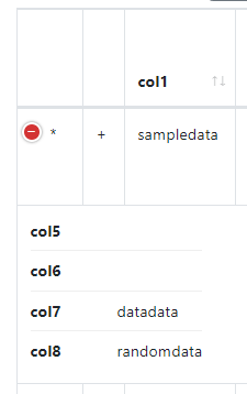
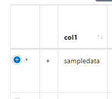
When I click on the blue + button, this is what I see:
Which is basically the hidden columns of the main table's row. I do not want this.
What I want is: Both the outer table and the inner table should HIDE columns if the size of the screen becomes small based on responsive priority. Right now, I observe this behavior in the outer table ONLY but not in the inner table. But I want it in the inner table also.
Sorry but your description is still confusing becuase you say you want Responsive off but you want hiding of columns based on screen size. Are you asking for the Responsive child to be a Datatable that also has Responsive behavior instead of a list of columns?
Kevin
@kthorngren
I do want the responsive behavior of hiding columns but NOT showing the hidden columns as the children.
My inner table/child of the row of outer table is completely independent of the outer table/row. So, when I click "+" or the expand button (which is predefined by me), I want the ONLY inner datatable to be shown (just like in the code example I provided in my previous post) - and this inner datatable must be responsive in the same way I described (i.e ONLY hide columns - do NOT turn then into children of rows)
So,
Yes. I don't want the list of columns from the outertable's rows to be the child of the outer table's row.
To simplify further, in my code example (http://live.datatables.net/teleletu/5/edit) how to make the children of rows responsive? I've tried turning on the responsive setting, but I don't see any hiding of columns of the inner tables.
Hope this clarifies my request.
I think you want this example:
https://datatables.net/extensions/responsive/examples/child-rows/disable-child-rows.html
I'm not a CSS expert nor have a specific example to show you but I would look at placing the child
tableinside adivthen use CSS to keep thatdivwithin the outerdiv. Notice that when you open the child the outer table/div expand. Maybe one fo the techniques described in this SO thread may help.Kevin
@kthorngren Thanks for the suggestion. I'm already using
responsive: {details: false}which I think is same asresponsive:false? and as I mentioned, I'm seeing this hidden columns hiding behavior already in my outer table. The problem is the inner/child tables in which I don't observe this behavior (despite having theresponsive: {details: false}setting).I will try your suggestion of wrapping the inner table with div and see how it goes.
@kthorngren I tried your suggestion. It seems that since the inner table's width defaults to 100% and the outer isn't fixed, it always overflows. But if I limit the inner table's container's width to a hard value like
500pxit works.Is there a way around this? This is just what allan has explained here: https://datatables.net/forums/discussion/35963/problem-with-responsive-datatable-inside-a-html-table. But if I use fixed outer table, it no longer becomes responsive to the screen size right?
Your example has this:
responsive:falsedisables responsive on the table. As described in the example, (responsive: {details: false}has responsive enabled but access to the detail roes is removed. I thought this is what you wanted.Sorry, like I said, I'm not much help with CSS. Maybe @allan or @colin can provide suggestions of how to have both tables responsive while the inner table stays within the width of the outer table. Are you using Bootstrap or other styling framework?
Kevin
@kthorngren Sorry for that confusion. What I meant was, I was using
responsive: {details: false}in my application which disabled the hidden-columns-as-children behavior. But the hiding of columns behavior is still active and working for outer table in my application - everything so far is working as expected. But this is the behavior I want for inner table also. Unfortunately, using the sameresponsive: {details: false}for inner table has no effect - meaning, the columns are NOT hidden based on the size available INSIDE the area of the outertable's row's child. This is the main issue I have.As you mentioned, I would need to work on CSS to achieve this. I'm not very knowledgeable in this either (heck, I'm not even a web-dev... ). I would really appreciate any help from other CSS experts here.
Here are a few tweaks to get it working a bit more like what you want: http://live.datatables.net/teleletu/7/edit .
But it still isn't right. The inner table isn't collapsing completely. I'm reasonably sure that this is because when the inner table is draw initially it is forcing the outer table to have a larger width. Then when Responsive reads the width of the containing element, it finds that it has plenty of space to play with, and so doesn't collapse down...
The closest I've come to a workaround for the moment is to put the inner table into a
divwhich has fixed width ( http://live.datatables.net/teleletu/8/edit ) - that could be calculated by Javascript.I'm not actually sure what the correct fix in Responsive will be for this. I need to think on it I'm afraid.
Allan
@allan Thanks for the suggestions. I'll see if I can use this.