Layout option seems to be inconsistent depending on features used
Layout option seems to be inconsistent depending on features used
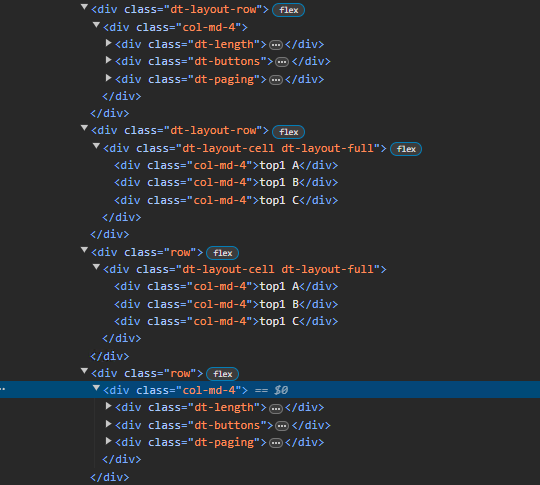
I'm trying to use the layout option to match the previously setup dom option where I added class names to each of the features to create a row of 3 features, with the middle one being centered. However I noticed inconsistent results,
- if I use div only features it adds the class name as expected (in the example below top2),
- if I add div features to a feature with a rowClass it adds a div element with "dt-layout-cell dt-layout-full" (see top1)
- if I use built in features and try to add class names I get a single div element with the last className used in the list (see top3)
- if I use built in features with a rowClass, I again get a single class with the last className from the list.
Any advice would be appreciated.
This is the layout I setup for testing:
layout:{
                top3:[
                    {
                        className:"col-md-4",
                        features:["pageLength"]
                    },
                    {
                        className:"col-md-4",
                        features:["buttons"]
                    },
                    {
                        className:"col-md-4",
                        features:["paging"]
                    }
                ],
                top2:[
                    {
                        div: {
                            className: 'col-md-4',
                            text: 'top1 A'
                        }
                    },
                    {
                        div: {
                            className: 'col-md-4',
                            text: 'top1 B'
                        }
                    },
                    {
                        div: {
                            className: 'col-md-4',
                            text: 'top1 C'
                        }
                    }
                ],
                top1:{
                    rowClass:"row",
                    features:[
                        {
                            div: {
                                className: 'col-md-4',
                                text: 'top1 A'
                            }
                        },
                        {
                            div: {
                                className: 'col-md-4',
                                text: 'top1 B'
                            }
                        },
                        {
                            div: {
                                className: 'col-md-4',
                                text: 'top1 C'
                            }
                        }
                    ]
                },
                top:{
                    rowClass:"row",
                    features:[
                        {
                            className:"col-md-4",
                            features:["pageLength"]
                        },
                        {
                            className:"col-md-4",
                            features:["buttons"]
                        },
                        {
                            className:"col-md-4",
                            features:["paging"]
                        }
                    ]
                },
                topStart:null,
                topEnd:null,
}
The result:

This question has an accepted answers - jump to answer
Answers
I think there is a slight misunderstanding about the structure of the DOM generated, and I'm reasonably sure that it is caused due to the use of the name
classNamefor two different things.The layout grid consists of
divrows, anddivcells inside them. Inside the cells are the features.controls the row and cell classes. It does not impact the feature elements that are inside the cell.
The
divcreates a newdivinside the cell. The class name of that child to the cell is controlled bydiv.className.The key here is that the layout grid is just a container for the features.
divperhaps confuses things a bit, but it is just a child of a cell like any other feature.Does that make a bit more sense now?
Allan
That does make more sense, is there any way to put a feature inside of a div tag with a specific class like col-md-4?
My goal is to basically have a centered buttons between pageLength and paging.
should be all that is needed: https://live.datatables.net/bafemiya/1/edit (you might need to hide some panels in the example environment to allow enough room to allow it to draw on a single line).
To explain a bit as to why your examples don't work:
top3doesn't because the array does not create a cell per entry. All of the entries get put into a single cell.top2/top1work, but there is no way to put a feature into thedivfeature. I had wondered about that when writing it, but decided not to at the time. It was getting quite recursive as it was!And
tophas the same issue astop3.At the moment there isn't a way to create an arbitrary number of cells in a layout row. You can have a single one (e.g.
top), or two (e.g.topStartandtopEnd).Spacing between items in a cell is done via CSS, and the default is that items on a full row are equally spaced - hence why my one liner works.
Allan
From your sample its not quite centered, the spacing between each panel is equal (as you said), however because the paging is much larger than the page length its not center. I started by trying this first, it ended up looking odd on my page.
I took your sample and found a work around like this: https://live.datatables.net/bafemiya/2/edit
No - it is equally spaced by default. Doing the width of 33% for the cell's children is the way do to it - nice one! You might want to do:
just to make sure it is nice and restricted.
Allan