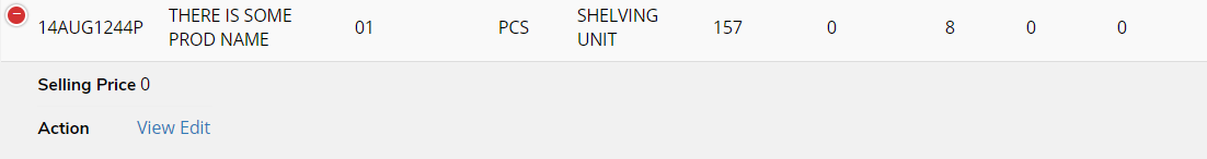
Responsive mode, column display when screen become smaller.
Responsive mode, column display when screen become smaller.
 teojicd
Posts: 6Questions: 6Answers: 0
teojicd
Posts: 6Questions: 6Answers: 0
When using the responsive option.
By default, the table has this behaviour when the width of the screen/table become smaller:
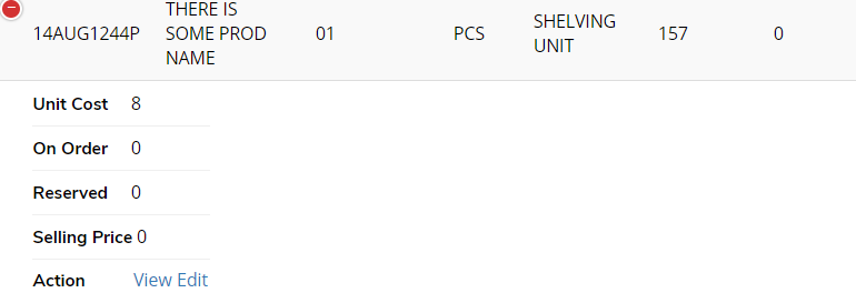
Each column appears on a newline, in the first picture, unit cost was shown above, when the table becomes smaller, the unit cost column is displayed on a newline.
I want to know if this can be customised ? For example, when resize, I want all the columns to appear horizontally on two rows instead.
This question has an accepted answers - jump to answer
This discussion has been closed.
Answers
Hi @teojicd ,
Yep, you have control over how the children are displayed by
responsive.details.renderer. There's an example of that here.Cheers,
Colin