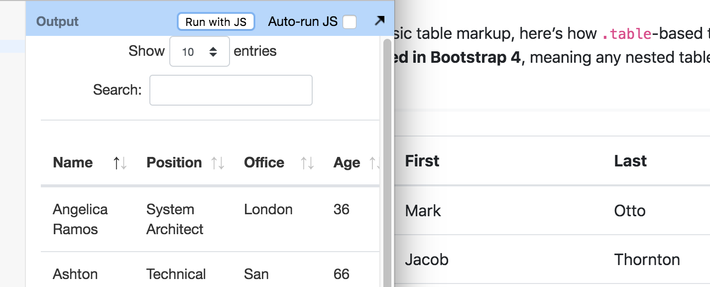
Bootstrap 4 bottom header line is fatter than expected
Bootstrap 4 bottom header line is fatter than expected
DataTables with bootstrap style renders quite a fat line between the header row and the first body row. It doesn't quite look good. I've tested with removing the "border-collapse" and it gets thinner, but still too fat.
Any ideas?
This discussion has been closed.
Answers
Is your BS4 Datatable different than this example?
https://datatables.net/examples/styling/bootstrap4.html
Kevin
If you remove "table-striped table-bordered" from the table class, the table is different than https://getbootstrap.com/docs/4.1/content/tables/
On my computer the lines above and below the headers are equally sized, but I see that the table on the bootstrap pages have a slightly fatter line below - but not as much as the DataTables does.
I'm unclear specifically what the issue is. Here is a BS4 styled Datatable just using the
tableclass.http://live.datatables.net/malodila/1/edit
I don't see much difference between that and the example you provided.
Is the problem the difference in the top line of you table from this comment?
Kevin
The latter. You dont see that the line between the header and the rows are fatter than on the bootstrap pages?
Like I said I see a slight difference between the two.
Here is a screen shot of what I see between the two. My example to the left.

You were describing two issues above and I was simply trying to narrow down exactly what the problem is. Hopefully Allan or Colin or someone more familiar with styling can provide some help.
Kevin
Yeah, lets hope so.
Ive also noticed that table width is problematic on responsive displays. Setting table width 100% solves the problem, but im not used to having to specify width.
Ill open a new question on this or see if its allready been asker.
Setting the table width to 100% is a general guideline for Datatables. My understanding is it allows Datatables to properly size the columns, etc. Not sure if its documented but a forum search should yield lots of responses about this.
Kevin