Responsive not working properly with semanticui styling
Responsive not working properly with semanticui styling
 Krakenos
Posts: 2Questions: 1Answers: 0
Krakenos
Posts: 2Questions: 1Answers: 0
Hello, I wanted to make my site mobile friendly by using responsive on my datatables but, I run into a problem. I couldn't get it to work properly because it wouldn't want to hide more columns when it hit 5 columns breakpoint. I thought it's problem with my implementation, so I looked into documentation. To my surprise the table in the documentation acted the same way as mine did. 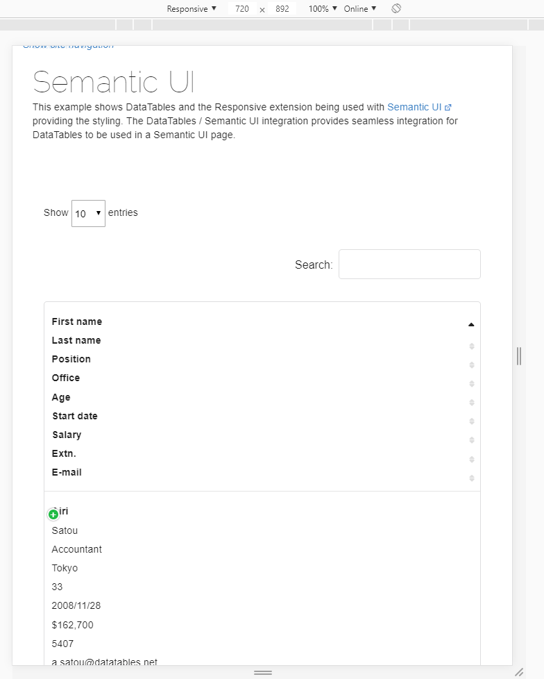
Is that a known issue? If so, how can I get behind it?
This question has an accepted answers - jump to answer
This discussion has been closed.
Answers
Hi @Krakenos ,
Yep, that doesn't look right. I've raised a Jira for it on our system (ominously DD-666), and will report back once there's an update.
Cheers,
Colin
In the Semantic UI docs it says:
Looks like using
unstackablein the class list for the table will resolve this.Allan
Adding unstackable to table class indeed gets the job done. Thanks for help.