JQuery/Popovers not working in responsive mode
JQuery/Popovers not working in responsive mode
 Miko12359
Posts: 7Questions: 4Answers: 0
Miko12359
Posts: 7Questions: 4Answers: 0
Hello, i have a large table with 3 buttons, 2 of the buttons work perfectly in both desktop and responsive mode, the last button which is the export button only works perfectly in desktop mode as shown:
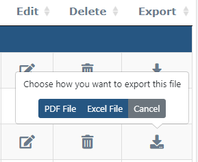
when the user is in responsive mode, this button does not work, it still triggers other javascript events but does not trigger the popover/ bootstrap confirmation event.
The code for the button is shown here:
//this is the code for the button
 <a role="export" class="btn custom-confirmation" data-original-title="" title="" data-popout="true" data-singleton="true"   data-content="Choose how you want to export this file" data-toggle="confirmation" aria-label="Settings" onclick="excelExport('<?php echo $portal['workpackage']; ?>');">
                                <i class="fas fa-download icon-colour  fa-lg" aria-hidden="true" >
                                </i>
                              </a>
This is the code for the Datatable
// Datatable initialization code
 $(document).ready( function () {


      if (document.getElementById('myTable')) {

    $('#myTable').css('visibility','visible');
    var table = $('#myTable').DataTable(
      {
        responsive: true,
        columnDefs: [
          {
            targets: [0, 3, 4, 5, 7, 8, 9, 11, 12, 13], visible: true}
          ,
          {
            targets: '_all', visible: false }
          ,
          {
            targets: [5,8,9],
            render: $.fn.dataTable.render.moment( 'DD MMM YY' )
          }
          ,
          {
            width: "20%", targets: [4] }
        ],
        "order": [[ 10, "des" ]],
        "pageLength": 10,
        rowGroup: {
          enable: true,
          dataSrc: 1,
        }
        ,
        "dom": '<"toolbar">frtip',
        initComplete: function(){
          $("div.toolbar").html('<button type="button" style="margin:5px;" id="modalcreate"  class="btn btn-primary" data-toggle="modal" data-backdrop="static" data-target="#exampleModalCenter1" onclick="getUser();">Create EWN</button>');
        }


      }
    );

      }
And lastly this is the code for bootstrap-confirmation http://bootstrap-confirmation.js.org/
//bootstrap-confirmation.js code
$('.custom-confirmation').confirmation({
    rootSelector: '.custom-confirmation',
    container: 'body',
    title: '',

    buttons: [
      {
        class: 'btn btn-primary',
        label: 'PDF File',
        onClick: function() {
alert('Exporting as PDF File');

    },
        value: 'PDF'
      },
      {
        class: 'btn btn-primary',
        label: 'Excel File',
        onClick: function() {
alert('Exporting as Excel File');
            document.getElementById('submittask4').click();

    },
        value: 'Excel'
      },
      {
        class: 'btn btn-secondary',

        label: 'Cancel',
        cancel: true
      }
    ]
  });
            });
I want to be able to click the button while on mobile view and have the prompt appear as in the picture on the first click.
Thanks for any help
This discussion has been closed.
Answers
Hi @Miko12359 ,
There's a lot going on there. We're happy to take a look, but as per the forum rules, please link to a test case - a test case that replicates the issue will ensure you'll get a quick and accurate response. Information on how to create a test case (if you aren't able to link to the page you are working on) is available here.
Cheers,
Colin