How can I change the style nof checkbox in SELECT extension?
How can I change the style nof checkbox in SELECT extension?
 rpcabrera
Posts: 2Questions: 1Answers: 0
rpcabrera
Posts: 2Questions: 1Answers: 0
Hi!, I'm using the SELECT extension, but I don't see an option to change the display style of the checkbox. I can override the extension css but I wonder if there is a better option. Thanks in advance!
This discussion has been closed.
Answers
Hi @rpcabrera ,
In this example it's adding a classname to the checkbox - as you say, you can then have your CSS to style and format. That's a good way to go.
Cheers,
Colin
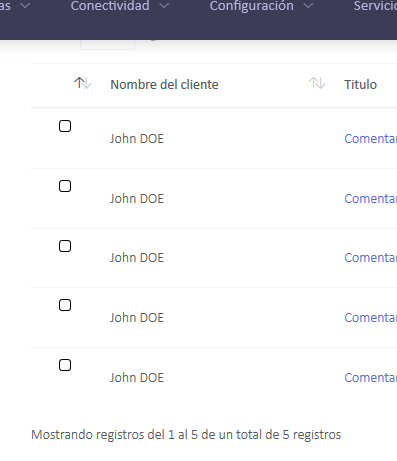
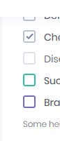
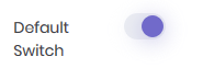
Hi Colin, this is my situation: in the first image my datatable with the select extension, it works fine, but I want to change how it look like. For example (see 2nd and 3rd image) I wanna use Metronic components like checkboxes and switch. Inspecting the select extension, I realize that it uses the td:before element instead a checkbox input, so I would appreciate any help to realize my purpose. Thanks in advance.
Hi @rpcabrera ,
If you setup Responsive like this here - it's just using that first column as the control to open the child. You can then use
columns.renderorcreatedRowto add your icon into that first column.Hope that helps,
Cheers,
Colin