Dropdown menu inside a cell...problem with overflow
Dropdown menu inside a cell...problem with overflow
I'd like to insert different dropdown menu inside a cell in datatables.
Without this CSS code:
   .table-responsive,
   .dataTables_scrollBody {
      overflow: visible !important;
   }
the dropdown menu remain inside the cell and is cutted out by border of the cell (scroller appears to all table!)
Adding the CSS written before, seems to be ok (when responsive is enabled). But when responsive is disabled, I get all columns going out the screen (using a small screen)
See my fiddle:
http://jsfiddle.net/umjdeLnq/2/
Is there any way to use a dropdown menu in the correct way?
Answers
Hi @itajackass ,
With your example, I set
responsiveto bothtrueandfalse, and both looked the same. Could you give steps on how to reproduce, please.Cheers,
Colin
Hi @colin I just give you wrong fiddle:
Here is the correct fiddle with 4 examples: http://jsfiddle.net/15f73pts/2/
example 1: CSS disabled: column action has a dropdown that don't show well
example 2: CSS enabled and responsive disabled: all ok cause i have only few columns that doesn't exceded the screen
example 3: CSS enabled and responsive enabled: all ok!
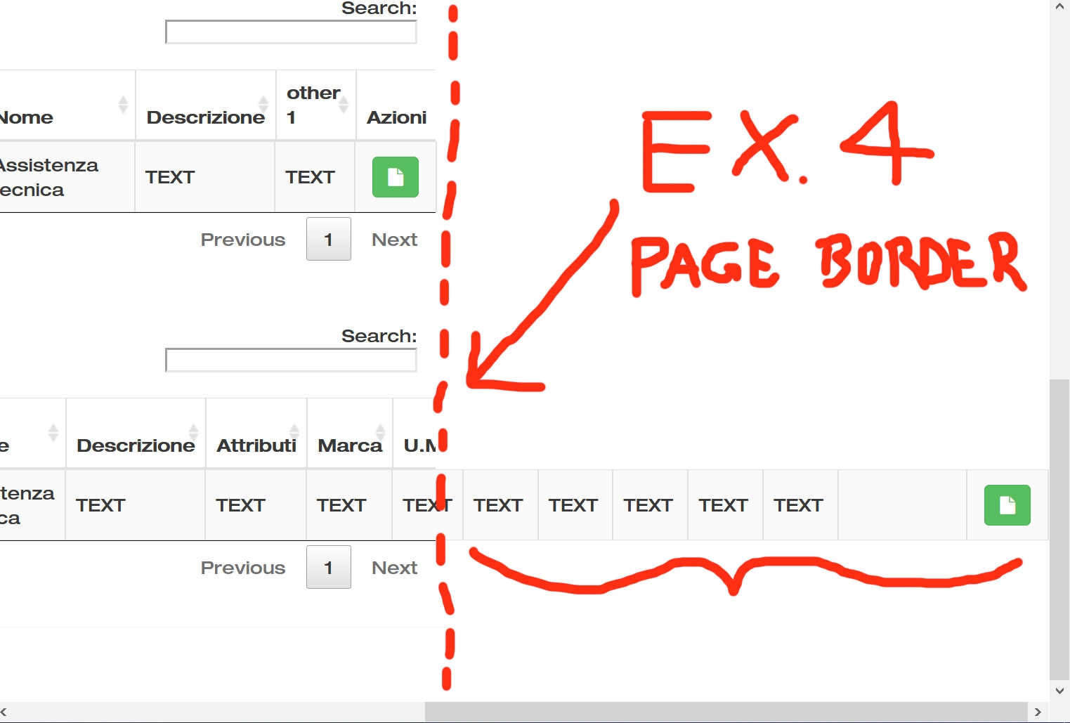
example 4: CSS enable and responsive disabled with a lot of columns: drowpdown is ok but columns are show ALL and go outside the screen
I need to solve the case 4: i need dropdown ok, and scroller X working ok on the table with responsive OFF
Hi @itajackass ,
I enabled Responsive and it seems to behave as you want - see here. Am I missing something?
Cheers,
Colin
Hi @colin .
Maybe your screen is too big and don't see the problem. I'll attach a screenshot.
I need to solve the dropdown when RESPONSIVE IS OFF in example 4.
Columns going outside the size of the table using overflow: visible. If I'll use overflow: hidden columns are ok...but dropdown broke.
Hi @itajackass ,
It's your CSS, if you remove this, it'll work:
Cheers,
Colin
Hi @colin ,
I have inserted this CSS to show correctly the dropdown. If I'll remove this CSS, dropdown visualization broke (It's "hidden" inside the table). See attachment.
You've got scrolling enabled, so anything inside the scrolling container is going to be cut off. Its also worth keeping in mind that Responsive and horizontal scrolling are effectively incompatible since they are attempting to solve the same issue (wide table / narrow screen).
I'd suggest doing it without scrolling, have Responsive enabled and set the column priority high for the column you want to keep visible.
Allan
Unable to solve this problem. Same issues with me also. If you found any solution then please comment below. I am waiting your reply.