Is there a way to prevent a column hidden by media size from showing in the child row?
Is there a way to prevent a column hidden by media size from showing in the child row?
 kconrad
Posts: 5Questions: 2Answers: 1
kconrad
Posts: 5Questions: 2Answers: 1
I have a DataTable using Responsive so the display can be seen nicely across all screen sizes. I have a column that I am using to denote whether or not the row has child row data that can be seen by selecting the row, but I have it set up so that it only shows at mobile screen sizes. My issue is that at the larger screen sizes, this hidden column is displaying in the child row. Is there any way to hide the column from appearing in the child row but still appear at the smaller screen size? My code is below:
<table class="responsive display no-wrap" id="featuresList" style="width:100%">
<thead>
<tr>
<th class="max-mobile"> </th> <!-- Column for the show/hide button -->
<th data-priority="10001">Permission Type</th>
<th data-priority="1">Title</th>
<th data-priority="10003">Description</th>
<th data-priority="10003" style="text-align:center;">View</th>
<th data-priority="10003" style="text-align:center;">Add</th>
<th data-priority="10003" style="text-align:center;">Edit</th>
<th data-priority="10003" style="text-align:center;">Delete</th>
<th data-priority="1"> </th>
</tr>
</thead>
<tbody>
<!-- Removed for this sample -->
</tbody>
</table>
$('#featuresList').DataTable({
    "fixedHeader":true,
    "searching":true,
    "bLengthChange":false,
    "bPaginate":false,
    "info":true,
    "language":{
    },
    responsive: {
        details: {
            type: 'column',
            target: 'tr'
        }
    },
    "columnDefs":[
        {"width":"5%", "targets":[0], "searchable":false,"orderable":false},
        {"width":"10%"},
        {"width":"20%"},
        {"width":"30%"},
        {"width":"5%"},
        {"width":"5%"},
        {"width":"5%"},
        {"width":"5%"},
        {"width":"15%", "targets":[8], "searchable":false,"orderable":false,"visible":true}
    ],
    "aaSorting":[]
});
Here are some images to help show what I'm talking about.
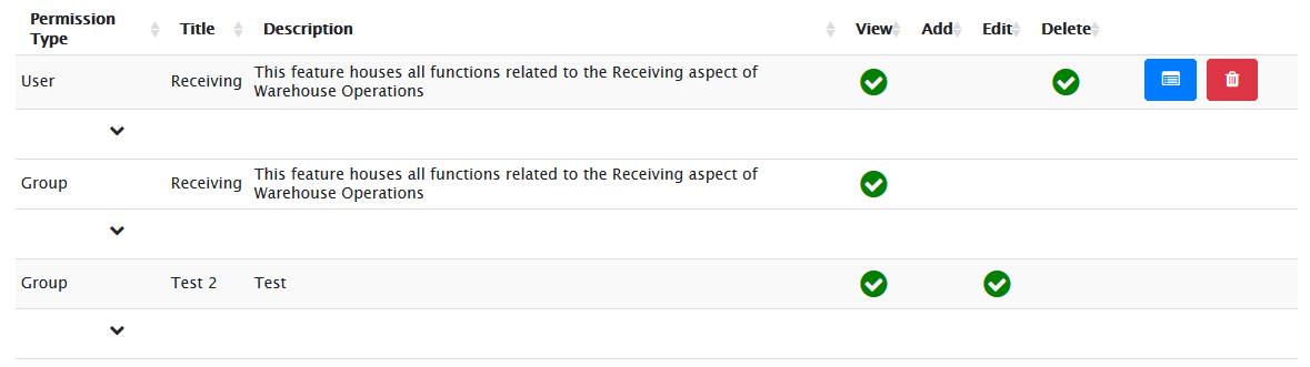
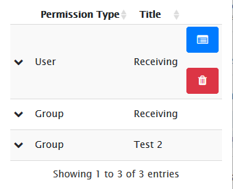
As you can see, in the first image the chevron is visible in the child row, and the second image shows as expected in a mobile view.
Ideally I'm looking for a way to stop that column from appearing in the child row at larger screen sizes.
Answers
Hi @kconrad ,
This example might help. It's showing how the '+' is removed when there are no hidden rows. Hope that does the trick. If not, could you modify that example to demonstrate your problem,
Cheers,
Colin