Flexible table width not working with Android phone in Chrome
Flexible table width not working with Android phone in Chrome
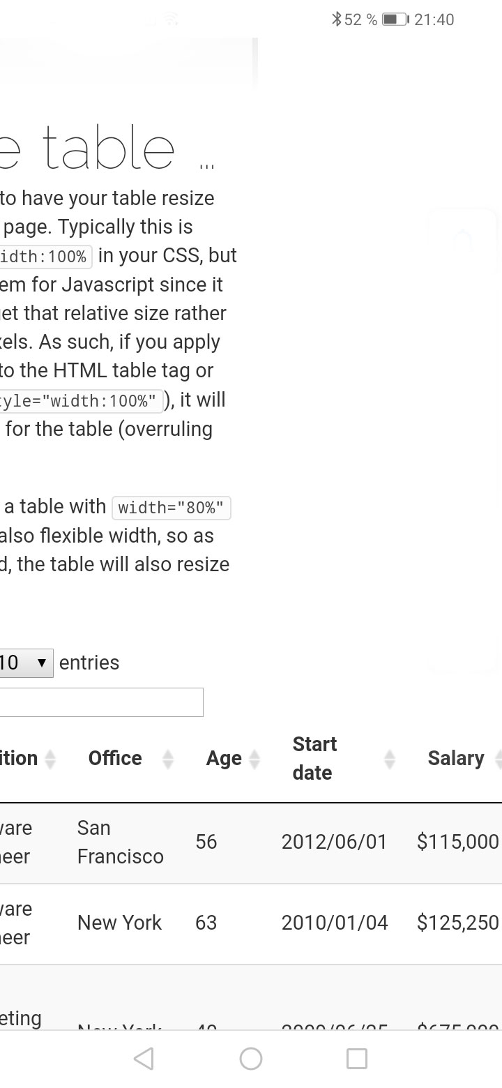
I have problem with getting Bootstrap to play with DataTables and flex in phone-mode using an Android Phone in Chrome. With iOS there is no problem. Have a look at the screenshot taken from
https://datatables.net/examples/basic_init/flexible_width
The table stretches out of the grid. Any suggestion for getting it to stay inside?
This discussion has been closed.
Answers
We're happy to take a look, but as per the forum rules, please link to a test case - a test case that replicates the issue will ensure you'll get a quick and accurate response. Information on how to create a test case (if you aren't able to link to the page you are working on) is available here.
Cheers,
Colin
Hi again!


Sorry I couldn't make myself clear. I first became aware of the problem in my own site when using an Android phone with Google Chrome. The table is overflowing as you can see in attached screenshot. I then visited your site with the same Android phone using Google Chrome. Link here : https://datatables.net/examples/basic_init/flexible_width
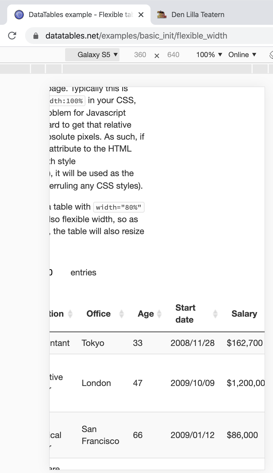
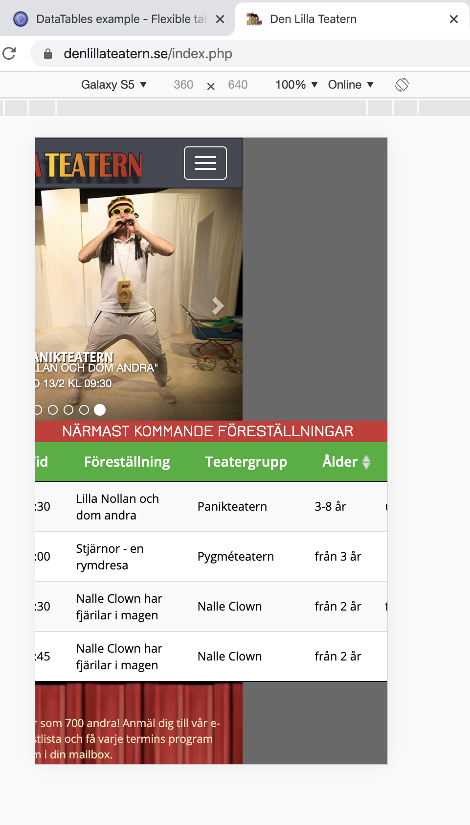
The same problem also appears on your site(that was why I didn't do a test-case as it also appears at your site with flexible tables). The table overflows the grid. Best it could be seen in Chrome developer tool. I´ve attached two screenshots below. Hoppefully I will be understood and helped to a solution.
Kind regards/PA
Yes - the flexible width example doesn't collapse the table down. When you make the window narrow enough that the browser can't shrink the table any more, due to the content shown in the table, it will just start overflowing.
We created our Responsive extension to collapse the table when required.
Allan
Colin has just pointed out the table on your site does use Responsive (I was looking at the flexi width example on our site which you linked to, thinking they'd be using the same options).
Could you try using
dt-responsiveas a class name rather thanresponsivein thetable. Since you are using Responsive, theresponsiveclass means something to Bootstrap.Allan
Thanks Allan!
I tried with dt-responsive but it didn't make any difference. I think it has something do to with that Google Chrome displays an issue with flex box and overflow. If I get rid of fllex the problem disappears in Chrome. I ´ll dig deeper in to this and find some solution in the css-rules so I can keep the flex-display. If anyone have a suggestion please post a comment even if it's not a Datatables issue(which I think I now spotted). Thanks again for your time and answer!