Colspan header responsive issue
Colspan header responsive issue
 deadend5001
Posts: 13Questions: 2Answers: 0
deadend5001
Posts: 13Questions: 2Answers: 0
I am running into an issue where I have a header with two rows and some rowspans/colspans. When I use the table on mobile, it not only displays wrong but also doesn't keep the header info, the coloring is removed, etc.. Thoughts?
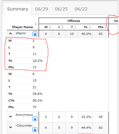
This is how it looks on mobile:
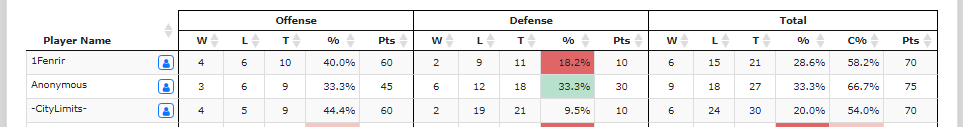
This is how it looks on desktop:
This is the top portion of the table
             <table id="playerSummaryList" class="display responsive cell-border compact" cellspacing="0" width="100%">
                <thead>
                  <tr>
                    <th rowspan="2" valign="bottom" >Player Name</th>
                    <th colspan="5" class="text-center">Offense</th>
                    <th colspan="5" class="text-center">Defense</th>
                    <th colspan="6" class="text-center">Total</th>
                  </tr>
                  <tr>
                    <th class="text-center">W</th>
                    <th class="text-center">L</th>
                    <th class="text-center">T</th>
                    <th class="text-center">%</th>
                    <th class="text-center">Pts</th>

                    <th class="text-center">W</th>
                    <th class="text-center">L</th>
                    <th class="text-center">T</th>
                    <th class="text-center">%</th>
                    <th class="text-center">Pts</th>

                    <th class="text-center">W</th>
                    <th class="text-center">L</th>
                    <th class="text-center">T</th>
                    <th class="text-center">%</th>
                    <th class="text-center">C%</th>
                    <th class="text-center">Pts</th>
                  </tr>
                </thead>
This discussion has been closed.
Answers
We're happy to take a look, but as per the forum rules, please link to a test case - a test case that replicates the issue will ensure you'll get a quick and accurate response. Information on how to create a test case (if you aren't able to link to the page you are working on) is available here.
Cheers,
Colin
Sorry about that. I will make sure to do that in the future.
Here is the test link: http://live.datatables.net/ruwehisa/1/
Note when you scale your browser window smaller the colspan headers stay and render off of the page. Additionally you lose the details on the green circle +.
Ah I see, thank you for the test case, it helped understand the issue. Complex headers (with ColSpan) aren't supported within Responsive - but this SO thread may help.
Colin
So that's confusing. The example I gave you is using responsive 2.2.4. It looks like there was a hotfix in 2.1.0. The other work-arounds didn't work in the test version either. So basically just stuck with this behavior?
Hi,
I'm afraid Colin is correct, Responsive currently doesn't work with complex headers. It used to (sort of) because it made use of DataTables' built in column visibility to hide columns and that does support complex headers. But that had a whole bunch of other limitations, so we had to switch to its own implementation to hide columns - and that doesn't (yet) support colspan.
Likely it won't until DataTables v2 where I've overhauled how the complex headers work - that is likely some time off I'm sorry to say.
So yes, at the moment, complex headers do not work with Responsive.
Allan