Responsive not working in mobile view - missing some columns
Responsive not working in mobile view - missing some columns
 cratag
Posts: 10Questions: 3Answers: 0
cratag
Posts: 10Questions: 3Answers: 0
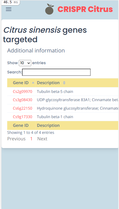
I have a rails app that uses mobile view as well. I've read adding responsive: true would make it fit in the view, but it doesn't. My table has 4 rows, and shows only two of them in mobile - and I cant scroll right to see the whole table.
<table class="table table-sm table-dashboard data-table no-wrap mb-0 fs--1 w-100" id="myTable" data-gene="gene">
...
</table>
  $('#myTable').DataTable({
    responsive: true
  });
PC view:

Mobile view:
No errors in the console
This question has an accepted answers - jump to answer
This discussion has been closed.
Answers
Are you including the Responsive extension js file?
https://datatables.net/extensions/responsive/
Oops, I missed that, sorry. Thank you