Viewing issues with Colvis
Viewing issues with Colvis
Hello guys,
first and foremost sorry for my bad Eglish, but not is my primary language.
Second, i have configured DataTables with Colvis support and work very well, but broken my view. In details the standard configuration put the "Colvis" button on the right side of the div. I have modified this beaviuor with the css property and works fine as you can see in the screen below,

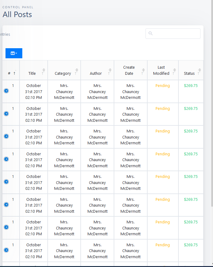
but in responsive mode the table is corrupt as you can see in this second screen.

By removing the css property, everything returns to its place, but the select is moved too far to the right.
Normal view:

Responsive view:

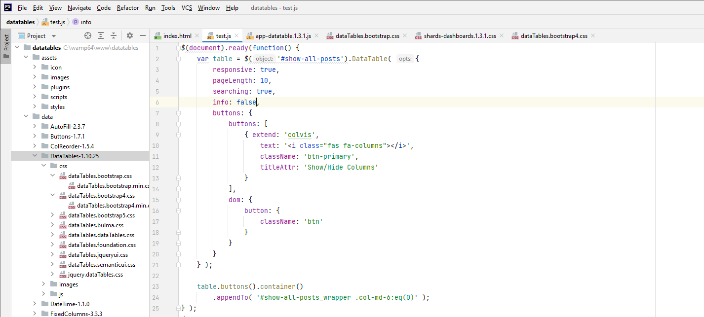
My codes:
Initialization of DataTables

I call the table in my html

CSS classes in my main.style.
.dataTables_length {
float: right;
/**margin-right: 300px;*/
}
.dt-buttons {
margin-top: 13px;
margin-left: 10px;
color: #fff;
background-color: #007bff !important;
border-color: #007bff !important;
}
Additional note.
Right now I'm using the "combined" version downloaded from the official site with all the plugins.
Thanks in advanced for response.
Adriano
Answers
We're happy to take a look, but as per the forum rules, please link to a test case - a test case that replicates the issue will ensure you'll get a quick and accurate response. Information on how to create a test case (if you aren't able to link to the page you are working on) is available here.
Cheers,
Colin
Hi Coline thanks for the reply.
I had seen the test case, but I decided not to use it because I am working on a rather complex template and I have to post a lot of code. In fact, if I only posted the two CSS rules I wrote in the question, you wouldn't have any effect.
It is not a problem for me to post long sequences of data, but I don't know if they can disturb other users. Please tell me.
Adriano
To progress this, we need to see the problem you want support with.
Colin