Data table - Extra details child rows
Data table - Extra details child rows
Hi,
I m using data table 1.10.20 and using the column-controlled child rows by setting the below :
        dataTableOptions: {
            columns: [{
              title: "column 1",
              className: "col1",
              data: function (row){
                   ........
               }"},
             {
              title: "column 2",
              className: "col2",
              data: function (row){
                   ........
               }"},

             {
              title: "column 3",
              className: "col3 none",     //// hide from the header
              data: function (row){
                   ........
               }"},

             ..........
             ...........

           {
              title: "column 4",
              className: "col4 none",       ////// hide from the header
              data: function (row){
                   ........
               }"},

             {
              title: "column 5",
              className: "col5",
              data: function (row){
                   ........
               }"},
        ],
       responsive: true,
        dom: 'ti'
    }
the functionality is working as expected. but when I maximize the window size or view on a smaller device, the other columns for example column 5 from the above code is also wrapped inside the child element. How can I make column 5 as a table header instead of showing it inside the child row?
https://datatables.net/ -- you the see the issue mentioned here in the example for the data table by zooming in on the screen.
however, it is not wrapped in this example https://www.datatables.net/blog/2017-03-31.
Am I missing something here?
Thanks
This question has an accepted answers - jump to answer
Answers
Sounds like there is a calculation error in the width available somewhere. When you say "zooming in on the screen", do you mean using the browser's zoom? That isn't a supported feature by DataTables as we have zero control about that - the browser doesn't tell us that something is zooming or not. As a result, we can only work at 100% zoom and if there is any change in the rendering at different zoom levels, then it is a browser bug.
Can you give me a link to a page that shows the issue at 100% zoom?
Allan
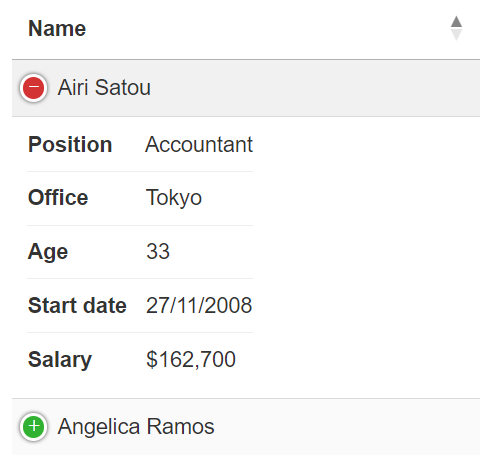
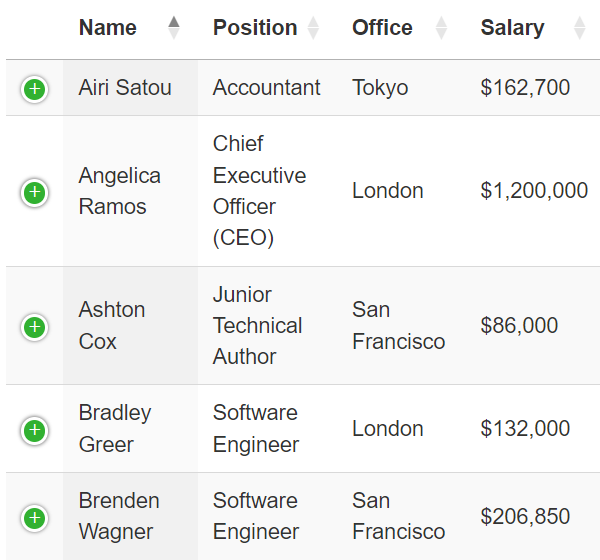
For the behavior, please refer the link https://datatables.net and the example is shown here for data table which is wrapping the header inside the child row on mobile view.
Desktop view

Mobile view
 -- I don't want to wrap like this instead, I would like to have the mobile view something like this mentioned in the below example.
https://datatables.net/examples/api/row_details
Mobile view

Please let me know if you need more details.
Thanks
You can use
responsive.details.rendererto customize the responsive child row output. See this example.Kevin
@kthorngren , thanks for the example link. The issue still exists with small screen size. when there are more columns in the table, especially with the mobile view (480px), the table scrollbar is not seen but it auto adjust the table by wrapping the columns. I think the responsive : true is overriding the default view. However, this is required to show the hidden cols
I guess I don't understand what you mean. When you say "wrapping the columns" do you mean they are placed in the responsive child or that they are wrapped when in the responsive child?
Are you trying to use
scrollXand responsive at the same time? They both are intended to solve the same problem with wide tables.Maybe you are wanting to use Class logic to force some tables ot the responsive child and others not.
Or maybe you don't want responsive at all and just want to use Child Detail rows to define what is displayed in the child.
Kevin