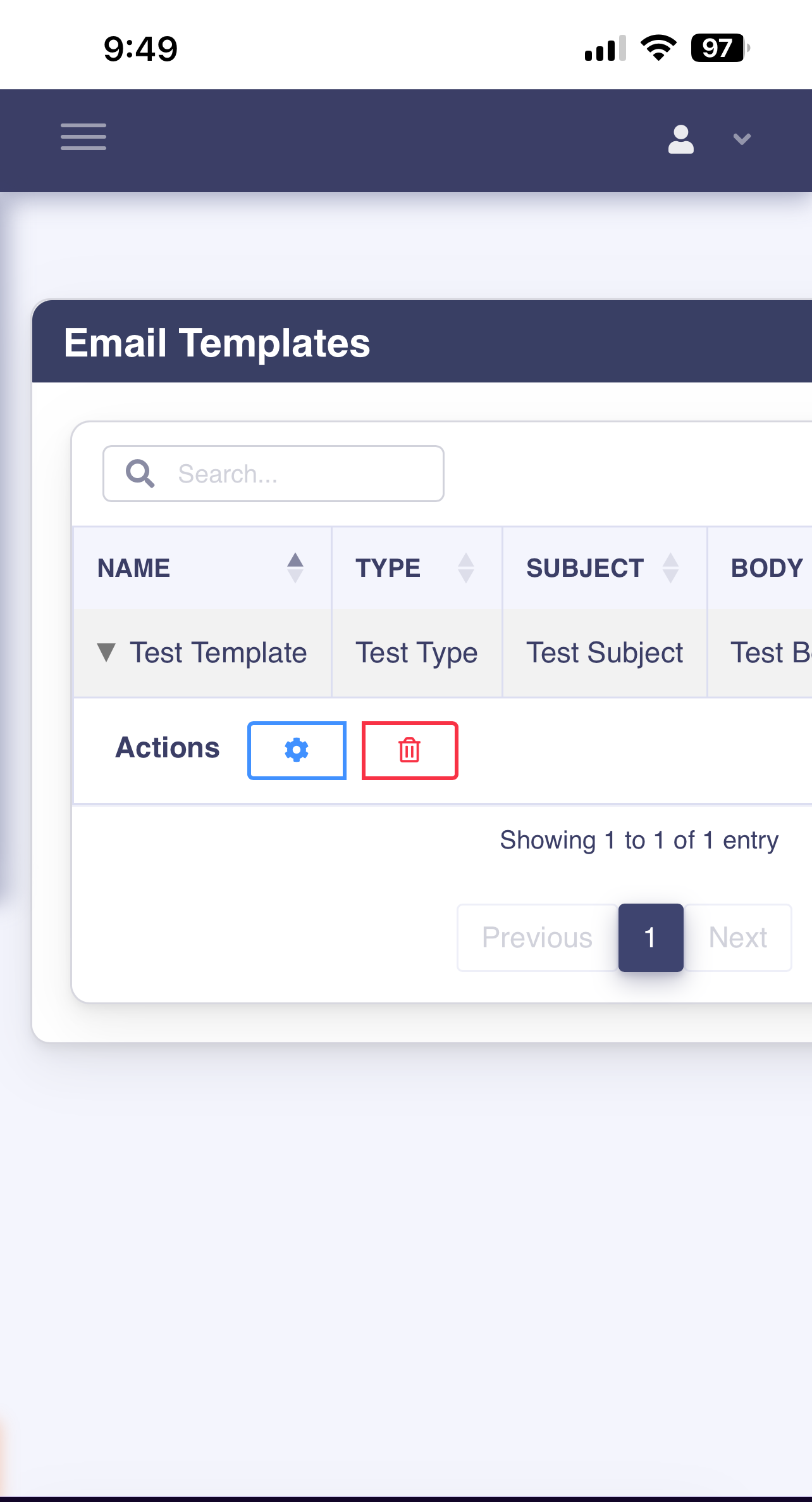
Responsiveness problem on mobile
Responsiveness problem on mobile
Hey everyone,
I'm having some problems integrating DT into my bootstrap4 website. I have gotten table responsiveness to kind of work, but it seems to only hide the very last "Actions" column. I can't seem to get it to properly shrink down/hide the other columns as needed when viewing the page on my phone (or on my desktop using mobile test mode).
I suspect it has something to do with how I have the datatable integrated with my bootstrap4 layout/theme, as the card I'm using seems to go off the screen on the right hand side when viewing it on mobile (but it looks find on my computer's browser).
Interestingly enough, when I put the same datatables code into a model and show it, then it works as expected, but I can't seem to get it to behave properly when not using a model.
I tried wrapping my entire "content" section in a div with a "container" class, but that didn't fix the issue (and it also made the datatable very narrow on my actual computer's browser).
I'm not sure how to solve this, but I'm hoping someone can offer some guidance. I've tried my best to make this compatible with JS Bin. Hopefully it works out okay. If it doesn't work, I can try to provide access to the actual site.
Here is a link to the demo on JS Bin: https://jsbin.com/vujumapuga/edit?html,output
Thanks for your time and help!

This question has an accepted answers - jump to answer
Answers
This thread and this also have the same issue. As you say, it isn't a DataTables error, but rather how Flexbox works.
In your case, add
max-width: 100%to yourdiv.app-contentelement and it should work.Allan
Wow! You're amazing - that solved it! A thousand thank yous! I have been struggling with this for days.
Really appreciate it