SearchBuilder View Disorganized
SearchBuilder View Disorganized
 Nastradamus
Posts: 4Questions: 2Answers: 0
Nastradamus
Posts: 4Questions: 2Answers: 0
Hello,
I am using SearchBuilder 1.7.1 with Bootstrap 4 styling in my app. I installed with NPM in a React application.
After adding SearchBuilder in datatable layout, I realize the SearchBuilder view is disorganised and is different from the one at the example page at https://datatables.net/extensions/searchbuilder/examples/styling/bootstrap4.html
I have attached photo of my SearchBuilder view below:
One ugly thing is that the first close button overlays the first column name selection, and is difficult to see what is behind.
Additionally, all the input controls individually stretch the full width of the container instead of all the inputs for a condition being on the same line. I do not know what I have to do to rectify this. I need assistance, please.
Answers
It looks like the CSS isn't being included for SearchBuilder. How have you got your build including the CSS for SearchBuilder and DataTables?
Allan
Hi Allan,
I have imported datatables and searchBuilder modules in my app. See image below:
I don't know if there is anything else I will need to import. If there is, please teach me how to do it.
That's the Javascript. What have you done for the CSS? Do you have
@import 'datatables.net...';type statements in there (assuming whatever bundler you are using can resolve that type of expression - Vite will).Allan
You were right @allan. The issue had to do with CSS not imported. I had to manually import the CSS for searchBuilder as seen in line 5 below:
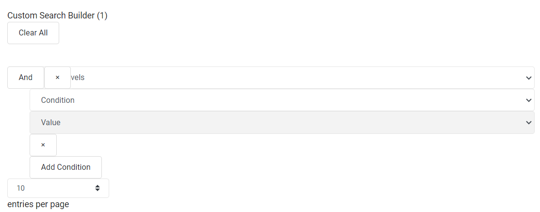
Now the search builder displays properly but there is a minor issue. The tilted And button overlays part of the data column selection as show in the area marked in red:
Surprisingly, if there are more than one data column specifiers, then it displays correctly:
This minor issue may require editing the CSS file directly but it is something I may want to avoid. Maybe overriding in a custom CSS will do. It looks better than before. Thank you.
I haven't seen that in the example on this site. Can you link to a test case showing that so I can look into it please?
Allan
I had the same problem, and had to write my own .css even with loading the correct ones provided. This is the best I could come up with, if someone has a better option I would love it. Thanks.
Thanks for posting your solution. If you are able to post a link to a page showing the problem, I can hopefully integrate a fix into the library's CSS.
Allan