Adjusting columns with Responsive
Adjusting columns with Responsive
I am trying to clean up rough edges of a React wrapper for DT and having issues getting it to work for some situations with Responsive extension.
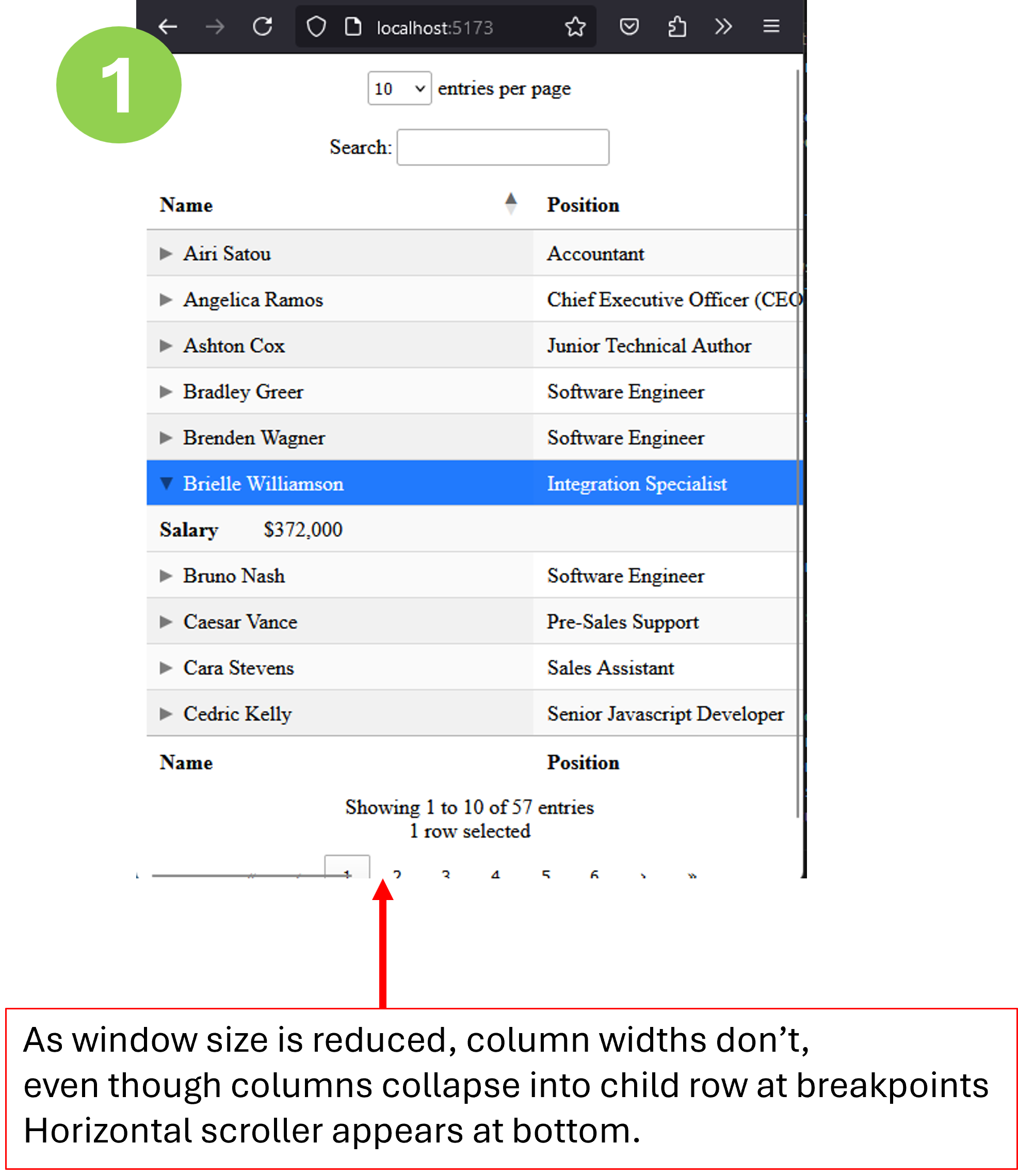
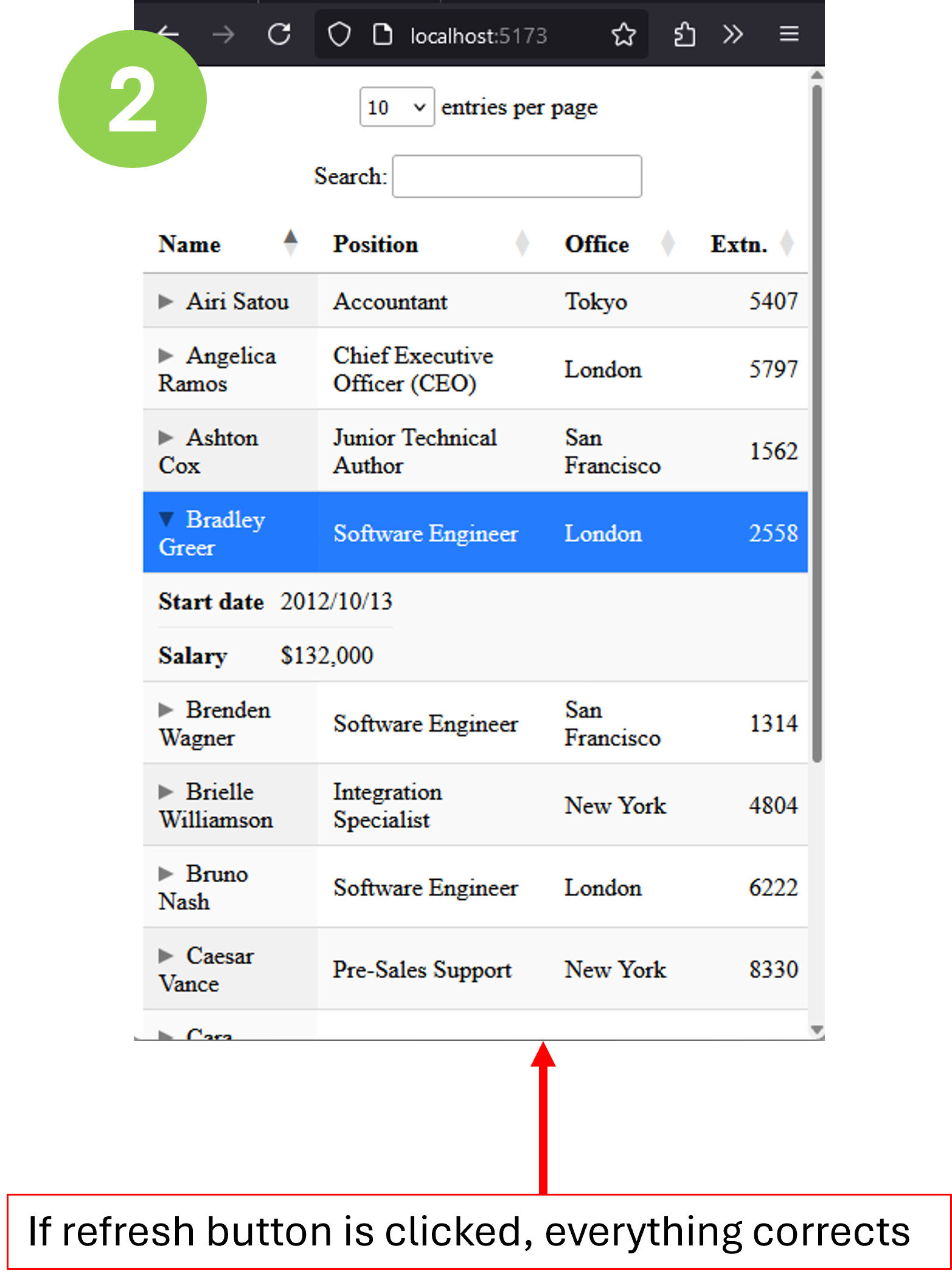
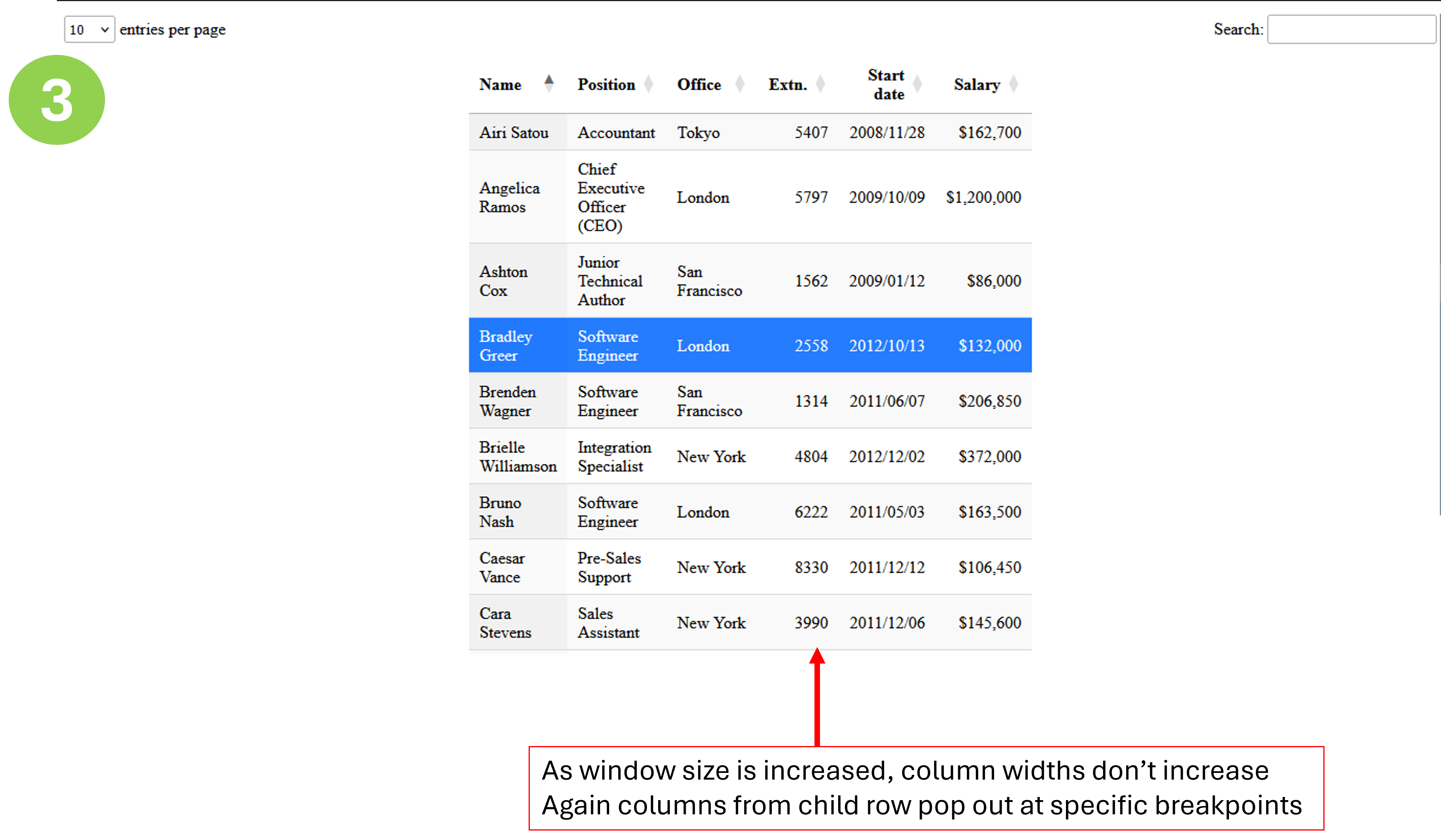
Basically, things appear ok on table init, but dynamically adjusting browser window size does not have same effect as it does with regular jQuery DT. These 3 pics illustrate.


I have set up listeners for resize on windows object as well as responsive-resize on the dt instance. Within them I have tried various combinations of responsive.rebuild(), responsive.recalc() and columns.adjust(). Even with all 3 together there is no improvement. Those events are correctly detected because I can see output from console.log() calls within the handlers.
I know you haven't delved into a React version yet but looking for any tips for what can be done. Is there some other event or function that can better intercept whats going on as a window gets resized?
Answers
I omitted the
style={{width: '100%'}}in the React component version when comparing with the jQuery version.Yes,
style="width: 100%"is currently required for DataTables to do its dynamic column widths. That will change with 2.1, which will automatically add 100% width as a style (and thus do the dynamic column widths) if an existing style or attribute width is not found.Allan