Cannot get column size to change on mobile device
Cannot get column size to change on mobile device
 Upkeeply
Posts: 7Questions: 3Answers: 0
Upkeeply
Posts: 7Questions: 3Answers: 0
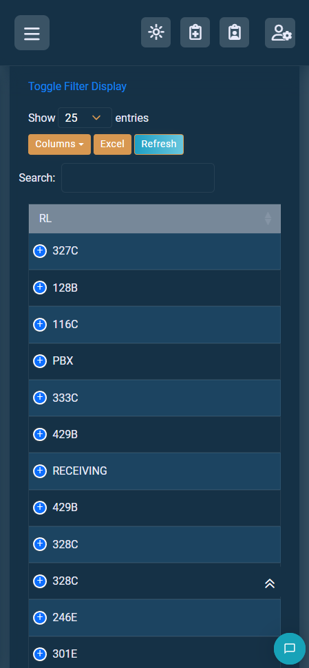
It currently looks like this. I have shortened the text to the max I can. I am at a loss, so I am hoping someone can help and see my issue.
My init...
  let acTable = $("#ac-datatable")
    .DataTable({
      autoWidth: false,
      columnDefs: [{ width: "30px", targets: 0 }],
      stripeClasses: ["strip1", "strip2"],
      buttons: [
        {
          extend: "colvis",
          text: "Columns",
          className: "btn-sm",
        },
        {
          extend: "excel",
          text: "Excel",
          className: "btn-sm",
        },
        {
          text: "Refresh",
          className: "bg-gradient-info btn-sm",
          action: function () {
            location.reload();
          },
        },
      ],
      responsive: {
        details: {
          renderer: function (api, rowIdx, columns) {
            const data = $.map(columns, function (col, i) {
              return col.hidden
                ? '<li data-dt-row="' +
                    col.rowIndex +
                    '" data-dt-column="' +
                    col.columnIndex +
                    '">' +
                    '<span class="dtr-title">' +
                    col.title +
                    "</span><br>" +
                    '<span class="dtr-data">' +
                    col.data +
                    "</span></li>"
                : "";
            }).join("");
            return data ? $('<ul class="dtr-details"/>').append(data) : false;
          },
        },
      },
    })
    .buttons()
    .container()
    .appendTo("#ac-datatable_wrapper .col-md-6:eq(0)")
    .removeClass("btn-group");
                   <table class="table table-bordered key-buttons border-bottom dt-responsive" id="ac-datatable" data-order='[[5, "desc"]]'>
                        <thead>
                        <tr>
                            <th class="border-bottom-0" data-priority="1">RL</th>
                            <th class="border-bottom-0" data-priority="2" th:text="#{table.ac}">Label</th>
                            <th class="border-bottom-0" data-searchable="false" th:text="#{table.timetocompletion}">Label</th>
                            <th class="border-bottom-0" th:text="#{table.asset}">Label</th>
                            <th class="border-bottom-0" th:text="#{table.raisedby}">Label</th>
                            <th class="border-bottom-0" th:text="#{table.creationdatetime}">Label</th>
                            <th class="border-bottom-0" th:text="#{table.completeddatetime}">Label</th>
                            <th class="border-bottom-0" th:text="#{table.assignedto}">Label</th>
                            <th class="border-bottom-0" th:text="#{table.status}">Label</th>
                            <th class="border-bottom-0" data-visible="false" th:text="#{table.id}">Label</th>
                            <th class="border-bottom-0" data-searchable="false" data-sortable="false" th:text="#{table.actions}">Label</th>
                        </tr>
                        </thead>
This discussion has been closed.
Answers
Looks like the cell with 328C has some up arrows to the right that might be affecting the column width. Can you post a link to your page or a test case replicating the issue so we can help debug?
https://datatables.net/manual/tech-notes/10#How-to-provide-a-test-case
Kevin
@kthorngren That is just a floating return to top button. Not in the column itself. I'll try and post something.
Possibly you need to add
style="width:100%"to thetabletag as documented in this example.Maybe you have data, in the RL column, longer than what is shown in the screenshot (on the page). By default Datatables will make the column the width of the longest cell in the column.
Looks like, in your screenshot, only the RL column is displayed and the others are hidden via responsive. Maybe the browser is extending the column to fit the width of the container.
Kevin