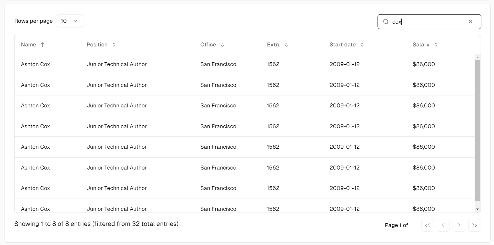
React component integration (Shadcn)

React component integration (Shadcn)

chocchoc Posts: 95Questions: 11Answers: 8

Link to test case: https://stackblitz.com/edit/datatables-net-react-simple-8cfqb3?file=src%2FApp.tsx
Description of problem:

I wonder how to use layout or dom for datatables.net-react?

Also I would like to **replace **the default Input elements from DT2 using shadcn (radix primitive components).

Is it possible with the current datatables.net-react to manipulate each sub components in the table?

Answers

  • allanallan Posts: 63,498Questions: 1Answers: 10,471 Site admin

    Currently no - sorry. The layout option does not yet support components.

    It is possible to write a plugin which returns a DOM node for use in layout, so it is possible to do with a useEffect hook, but you'd need to write the plugin for the components that you need, which isn't ideal. This is something that I would like to look at further in future.

    What might be a whole lot easier is to simply apply the class names you need to the input element:

    DataTable.ext.classes.search.input = 'flex h-10 w-full rounded-md border border-input bg-background px-3 py-2 text-sm ring-offset-background file:border-0 file:bg-transparent file:text-sm file:font-medium placeholder:text-muted-foreground focus-visible:outline-none focus-visible:ring-2 focus-visible:ring-ring focus-visible:ring-offset-2 disabled:cursor-not-allowed disabled:opacity-50';
    

    That's a lot of class names, but that's what the example in their docs uses...

    Allan

  • chocchoc Posts: 95Questions: 11Answers: 8

    Thanks allan,

    I'm also thinking about removing the default page length (select) and replace it with the React component and control with page.len() in useEffect.

    Replace also for the search input and use search() for control, i.e. all the built-in upper parts of the table are removed.

    Similar to the API access and usage. in the manual

    The only problem is the page length component. For example, it is no longer a select component, but a button that triggers the drop-down menu. So I can't just apply the classes as I did for the search input. I have to replace it.

    Example: https://stackblitz.com/edit/datatables-net-react-simple-hcabxj?file=src%2FApp.tsx

    You can see that both the built-in page length and the search input have been removed and the shadcn components are bound to the events.

    I will also prepare the dataTables.tailwindcss.js from Tailwind CSS (Tech. preview) to style the table

    I haven't tried it yet, but if the dataTables.tailwindcss.js also works for React, then I think the layout or dom part would be easier?

    What do you think about this?

    In my opinion, a headless datatable would be interesting too, so that there are fewer style issues and better customization options.

    But thanks for the events that are available in the react datatable, this makes customization much easier! (at least for the page length and the search input in my example above)

  • allanallan Posts: 63,498Questions: 1Answers: 10,471 Site admin

    In my opinion, a headless datatable would be interesting too, so that there are fewer style issues and better customization options.

    I think so too. I've considered it a number of times and I might come back to it, but as far as I recall, you are the first to ask for it :).

    The Tailwind integration basically just sets a bunch of classes, similar to what I showed above.

    This is the documentation for creating a feature plugin which you would need to do if you want to replace the length option with a div. That said, you may want to consider using the page length button which is part of the Buttons library.

    Allan

  • chocchoc Posts: 95Questions: 11Answers: 8
    edited September 9

    Thanks for the quick reply!

    I'll check out the feature plugin part! If I make some progress, I'd like to contribute to the showcase integrating the Shadcn style, if anyone is interested! But of course, more or less like Tailwind CSS (Tech. preview)

    Below is a screenshot showing how the above example is used to replace the built-in page length and search input. (For someone who is also interested in using a custom React component to interact with datatables)


  • chocchoc Posts: 95Questions: 11Answers: 8

    Hi Allan,

    Thanks for the hint of using Feature plug-in development.

    Now I have successfully make a rough shadcn style:
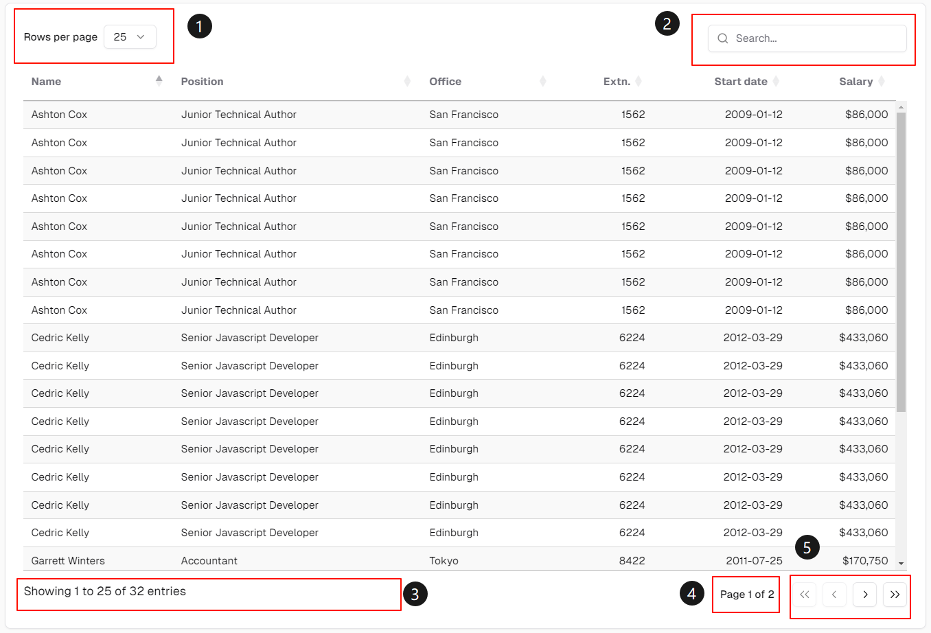
    I use ReactDOM.createRoot to replace the original page length and search input

    Currently I am adding a new information about the current page, I call it currentPageInfo for now, but I got a strange issue that the current page info:

            // add current page info
            const start = settings._iDisplayStart;
            const len = settings._iDisplayLength;
            const visRecords = settings.fnRecordsDisplay();
            const all = len === -1;
            const page = all ? 0 : Math.ceil(start / len);
            const pages = all ? 1 : Math.ceil( visRecords / len );
            console.log(start, len, page, pages); 
    

    is not updated on the website (the part number 4 in the screenshot, page 1 of 2) while typing in my custom input component (the part number 2 in the screenshot), but these values are indeed updated, as I can see from the console.log.

    When changing the pageLength value, or navigating to the next page, these values are updated:
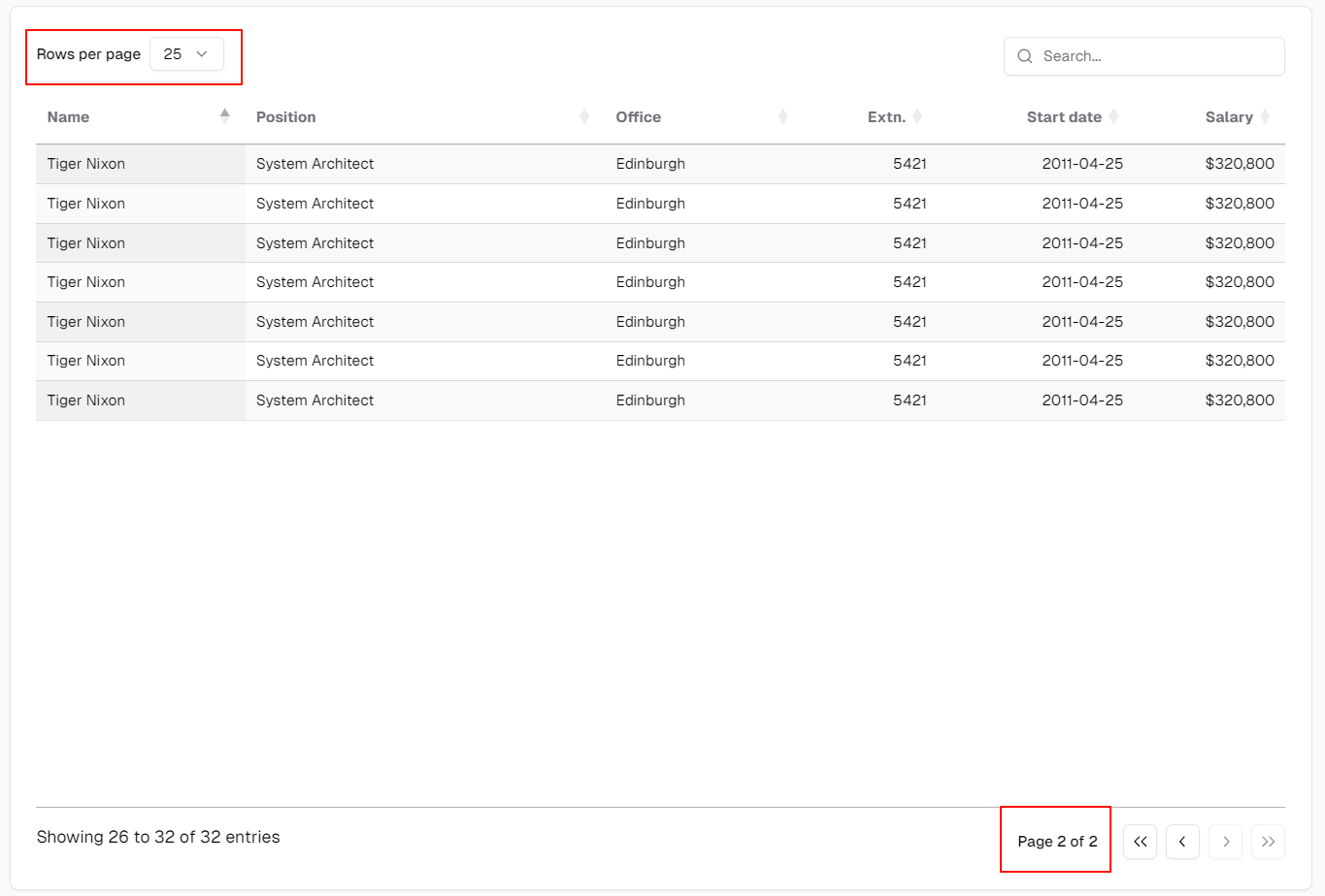
    Strangely also the filtered information is not updated when typing!
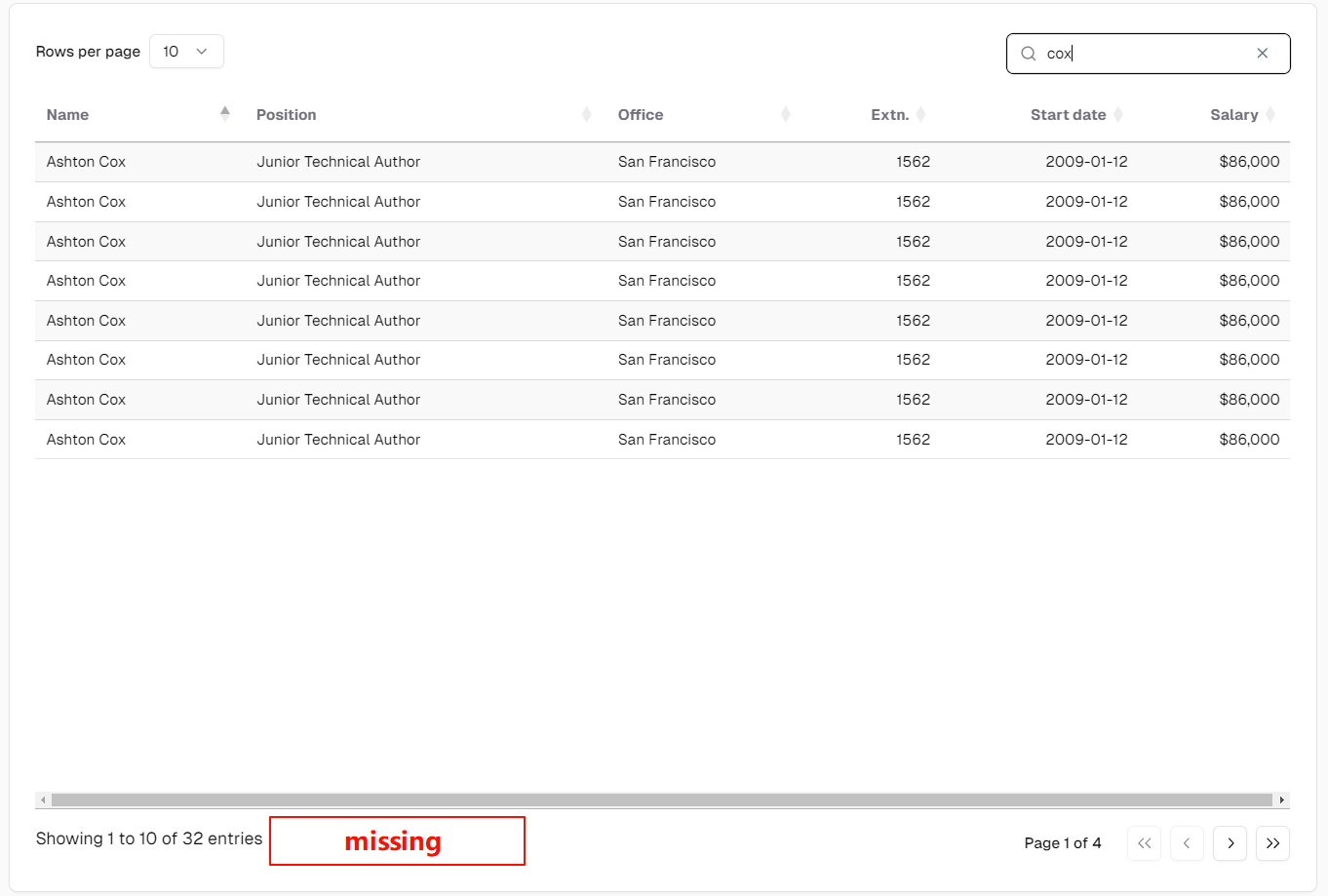
    Showing X to X of X entries (filtered from X total entries)
    (filtered from X total entries) is not showing.

    But as long as I use the original input component, part numbers 3 and 4 are both updated!

    Below is my code:

    in dataTables.tailwindcss.js

        DataTable.ext.renderer.pagingContainer.tailwindcss = function (settings, buttonEls) {
            var classes = settings.oClasses.paging;
    
            buttonEls[0].addClass(classes.first);
            buttonEls[buttonEls.length - 1].addClass(classes.last);
    
            // Create the pagination div
            const paginationDiv = $('<div/>')
                .addClass('flex items-center space-x-2')
                .append(buttonEls);
    
            // add current page info
            const start = settings._iDisplayStart;
            const len = settings._iDisplayLength;
            const visRecords = settings.fnRecordsDisplay();
            const all = len === -1;
            const page = all ? 0 : Math.ceil(start / len);
            const pages = all ? 1 : Math.ceil( visRecords / len );
            console.log(start, len, page, pages);
    
            const currentPageInfoDiv = $('<div/>')
                .addClass('flex w-full items-center justify-center text-sm font-medium')
                .text(`Page ${page + 1} of ${pages}`);
    
            return currentPageInfoDiv.add(paginationDiv);
        };
    

    in DataTablesSrc/js/features/features.search.js

    var __searchCounter = 0;
    
    // opts
    // - text
    // - placeholder
    DataTable.feature.register( 'search', function ( settings, opts ) {
        // Don't show the input if filtering isn't available on the table
        if (! settings.oFeatures.bFilter) {
            return null;
        }
    
        var classes = settings.oClasses.search;
        var tableId = settings.sTableId;
        var language = settings.oLanguage;
        var previousSearch = settings.oPreviousSearch;
        var input = '<input type="search" class="'+classes.input+'"/>';
    
        opts = $.extend({
            placeholder: language.sSearchPlaceholder,
            processing: false,
            text: language.sSearch
        }, opts);
    
        // The _INPUT_ is optional - is appended if not present
        if (opts.text.indexOf('_INPUT_') === -1) {
            opts.text += '_INPUT_';
        }
    
        opts.text = _fnMacros(settings, opts.text);
    
        // We can put the <input> outside of the label if it is at the start or end
        // which helps improve accessability (not all screen readers like implicit
        // for elements).
        var end = opts.text.match(/_INPUT_$/);
        var start = opts.text.match(/^_INPUT_/);
        var removed = opts.text.replace(/_INPUT_/, '');
        var str = '<label>' + opts.text + '</label>';
    
        if (start) {
            str = '_INPUT_<label>' + removed + '</label>';
        }
        else if (end) {
            str = '<label>' + removed + '</label>_INPUT_';
        }
    
        var filter = $('<div/>')
            .addClass( classes.container )
            .append(str.replace(/_INPUT_/, '<div id="dt-search-'+ __searchCounter+'"></div>' ));
    
        // Render shadcn <Input> component using React
        setTimeout(() => {
            const container = document.querySelector('#' + 'dt-search-' + __searchCounter);
    
            if (container) {
                console.log(`input ${'#' + 'dt-search-' + __searchCounter} exists`);
                ReactDOM.createRoot(container).render(
                    <React.StrictMode>
                        <SearchInputComponent />
                    </React.StrictMode>
                );
    
                __searchCounter++;
            }
        }, 0);
    
    
        function SearchInputComponent() {
            const [filterText, setFilterText] = useState('');
    
            // Handle the input change event
            const handleSearchChange = (event) => {
                const val = event.target.value;
                setFilterText(val);
    
                if (previousSearch.return && event.key !== "Enter") {
                    return;
                }
    
                /* Now do the filter */
                if (val != previousSearch.search) {
                    _fnProcessingRun(settings, opts.processing, function () {
                        previousSearch.search = val;
    
                        _fnFilterComplete(settings, previousSearch);
    
                        // Need to redraw, without resorting
                        settings._iDisplayStart = 0;
                        _fnDraw(settings);
                    });
                }
            };
    
            // for simplicity, I show only the input component here
            return (
                <input
                    type="text"
                    className="flex h-9 w-full rounded-md border border-input bg-transparent py-1 text-sm shadow-sm transition-colors file:border-0 file:bg-transparent file:text-sm file:font-medium placeholder:text-muted-foreground focus-visible:outline-none focus-visible:ring-1 focus-visible:ring-ring disabled:cursor-not-allowed disabled:opacity-50 px-9"
                    value={filterText}
                    onChange={handleSearchChange}
                    placeholder={opts.placeholder}
                />
            );
        }
    
        return filter;
    }, 'f');
    

    After checking several times, I still cannot find the cause of the issue.

    if I change back to the original input, the filtered text and the new currentPageInfo are both showing and updated.
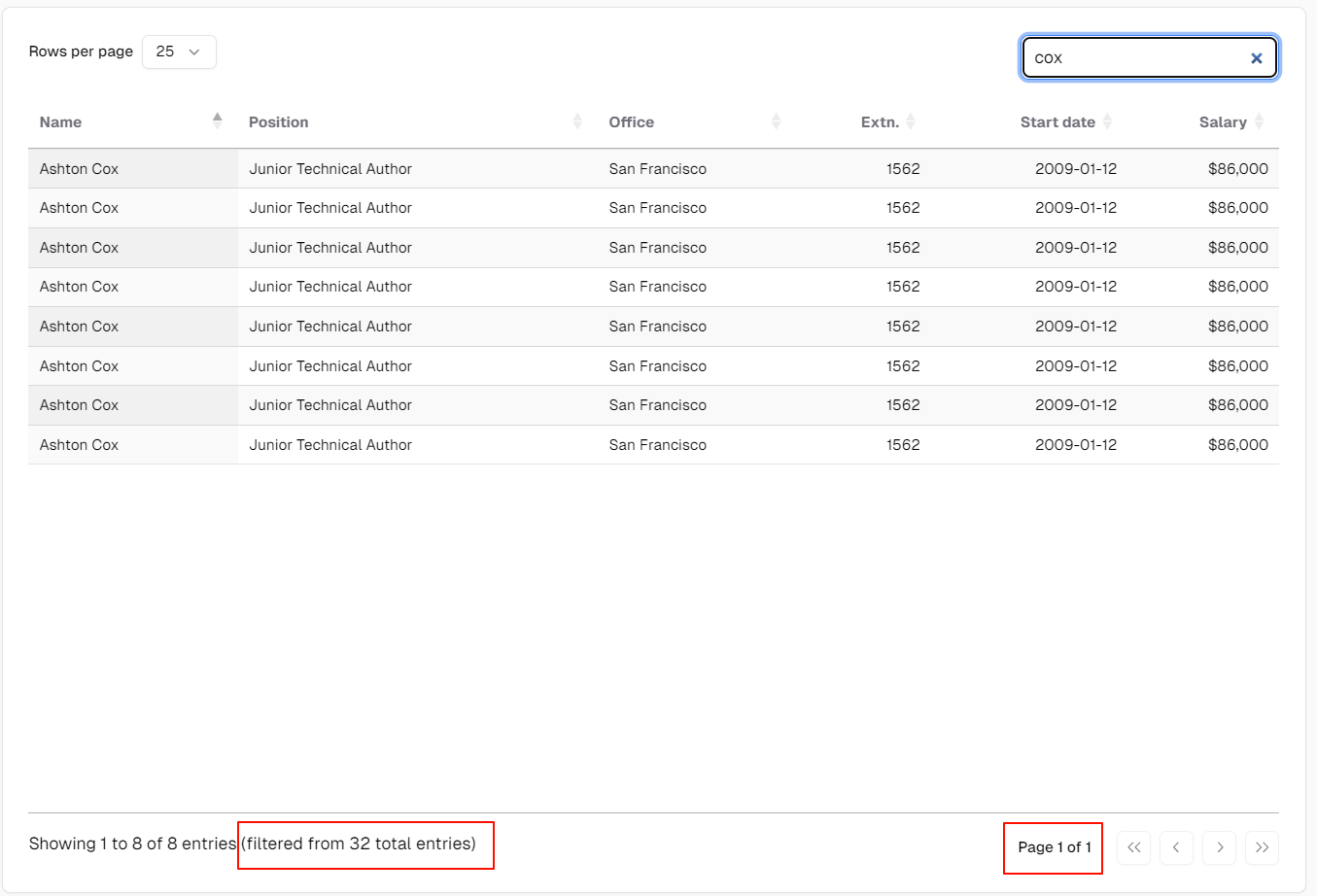
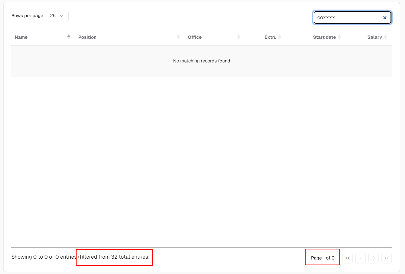
    Above are what I expected when using custom React input component.

    Do you have any idea what is wrong with the custom input? why the filtered information and the the currentPageInfo are not updated in the website?

    It might also be a good idea to add the currentPageInfo as a feature, maybe under the name pageInfo or something else. But here, to prove a quick idea, I created it inside DataTable.ext.renderer.pagingContainer.tailwindcss.

  • allanallan Posts: 63,498Questions: 1Answers: 10,471 Site admin

    I'm honestly not sure. If you are able to put a copy up on StackBltiz, I can take a look.

    For the table information element - is it really worth replacing the built in one? What do you need to be different about it?

    Allan

  • chocchoc Posts: 95Questions: 11Answers: 8

    Hi Allan,

    Since when disable the paging numbers
    (https://datatables.net/reference/feature/paging.numbers)

    The current page (and total page count) are unknown to the user.

    So I would like to add a currentPageInfo next to it in use with numbers: false.

    Kind of like moving out the current page number and the last page number from the pagination.

    One advantage of this that I can think of is the responsive design (for mobiles or small screens), where the pagination doesn't break if there are too many pages. And we can display only the previous and next button with the current page information on the left side.

    As for the StackBltiz, I will set up and get back to you! Thank you!

  • allanallan Posts: 63,498Questions: 1Answers: 10,471 Site admin

    I was morning thinking of the "Showing 0 to 0 ..." - I'm not really seeing the advantage of wrapping that into a React root?

    For Page x of y you can use the paging information control for that as well (info): https://live.datatables.net/rerizaku/1/edit

            info: {
              text: 'Page _PAGE_ of _PAGES_',
              search: '',
              empty: 'Page 0 of 0'
            }
    

    No need to create a custom control for that one.

    Allan

  • chocchoc Posts: 95Questions: 11Answers: 8
    edited September 16

    Hi Allan,

    Sorry, maybe I misled you. For the "Showing 0 to 0...", that's the built-in. I didn't wrap it with React actually.

    And wow! Thank you so much! I didn't know we could use the info like that! That's a real lifesaver!

    I will check later to see if it works for my custom React input component or not.

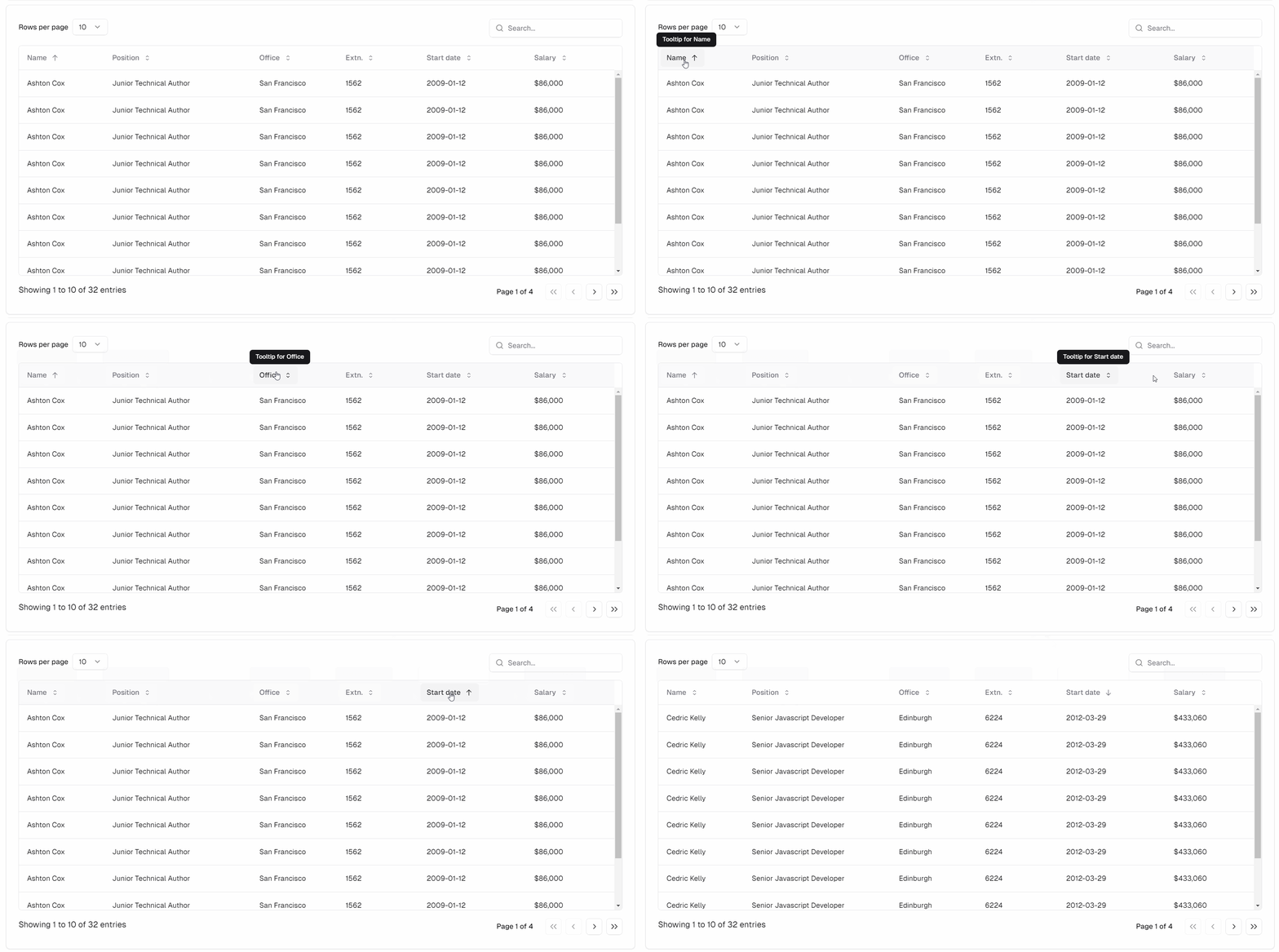
    I also managed to replace the table headers (and sort icon) with React, which is a button that contains the title in span and the sort icon as svg. And the most useful part is that when the mouse is on the table header, tooltip is displayed.

    I define the tooltip in columns:

    const columns = [
    {title: 'title 1', tooltip: 'tooltip for title 1'},
    …
    ];
    

    And add
    "sTooltip": null,

    in js/model/model.defaults.columns.js

    I can add a demo link later showing this tooltip feature.

  • chocchoc Posts: 95Questions: 11Answers: 8
    edited September 19

    @allan

    I accidentally fixed the issue with the input filter where the information is not updated when I use React.

    Before:

    var filter = $('<div/>')
        .addClass( classes.container )
        .append(str.replace(/_INPUT_/, '<div id="dt-search-'+ __searchCounter+'"></div>' ));
    
    // Render shadcn <Input> component using React
    setTimeout(() => {
        const container = document.querySelector('#' + 'dt-search-' + __searchCounter);
    
        if (container) {
            console.log(`input ${'#' + 'dt-search-' + __searchCounter} exists`);
            ReactDOM.createRoot(container).render(
                <React.StrictMode>
                    <SearchInputComponent />
                </React.StrictMode>
            );
    
            __searchCounter++;
        }
    }, 0);
    

    After changing just one line:

    var filter = $('<div/>')
        .addClass( classes.container )
        .append(str.replace(/_INPUT_/, '<div id="dt-search-'+ __searchCounter+'"></div>' ));
    
    // Render shadcn <Input> component using React
    setTimeout(() => {
        const container = filter.get(0); // Change to this
    
        if (container) {
            console.log(`input ${'#' + 'dt-search-' + __searchCounter} exists`);
            ReactDOM.createRoot(container).render(
                <React.StrictMode>
                    <SearchInputComponent />
                </React.StrictMode>
            );
    
            __searchCounter++;
        }
    }, 0);
    

    Then it works! I have absolutely no idea why using document.querySelector causes the information update to fail (but the DOM exists and the React component has actually been rendered).

    It's working now using .get(0):

    With Tooltip integrated:

    I just want to say that it's so nice that we can use DT2 (React) to add the React component to get such an integration. And a lot of functionality can now be easily created with React, for example the tooltip in the header.

    One possible use with React is the Context Menu, which in my opinion can now be easily built with https://ui.shadcn.com/docs/components/context-menu

  • allanallan Posts: 63,498Questions: 1Answers: 10,471 Site admin

    Excellent. Glad to hear that it has been useful for you :) It looks great in your screenshots.

    Allan

Sign In or Register to comment.