Datatable responsive problem with Grid layout
Datatable responsive problem with Grid layout
 rge75
Posts: 16Questions: 2Answers: 0
rge75
Posts: 16Questions: 2Answers: 0
I encountered display problems in Firefox when I'm using a grid layout. I created a test file where I only placed one grid element.
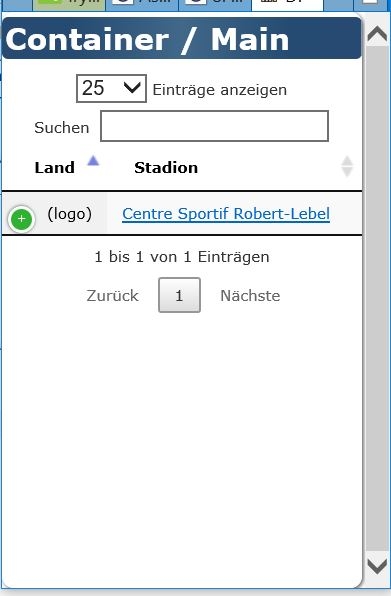
As you can see, it creates a horizontal scrollbar instead of hiding another column.
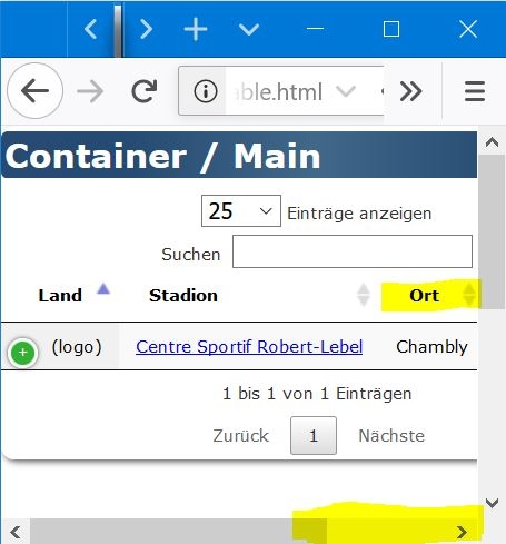
Even IE does it correct
You can test it yourself at
http://2019.hockeyarenas.net/DataTable.html
The "full" file is here (page still under development though) which works fine unter Chrome, but not under Firefox (IE grid not yet implemented, therefore not working on IE):
http://2019.hockeyarenas.net/?page=0300&lang=en
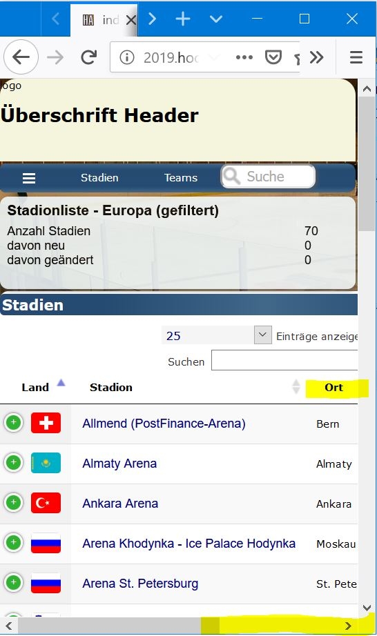
As you can see, the table content is too wide (wider than all the other grid elements).
Any idea how to overcome/fix this problem?
css of the test file
    @charset "utf-8";
    Body {
        font-family: verdana, arial, helvetica, sans-serif;
    }
    .titlebar_right {
        color: white;
        margin: 0px 0px 10px 0px;
        padding: 2px 2px 2px 2px;
        background: rgb(39,74,114);
        background: -webkit-gradient(linear, left top, right top, from(rgba(39,74,114,1)), color-stop(20%, rgba(37,75,114,1)), color-stop(50%, rgba(65,104,137,1)), color-stop(80%, rgba(37,75,114,1)), to(rgba(39,74,114,1)));
        background: -o-linear-gradient(left, rgba(39,74,114,1) 0%, rgba(37,75,114,1) 20%, rgba(65,104,137,1) 50%, rgba(37,75,114,1) 80%, rgba(39,74,114,1) 100%);
        background: linear-gradient(90deg, rgba(39,74,114,1) 0%, rgba(37,75,114,1) 20%, rgba(65,104,137,1) 50%, rgba(37,75,114,1) 80%, rgba(39,74,114,1) 100%);
        border-radius: 4px;
    }

    main {
        display: block;
        -ms-grid-row: 1;
        -ms-grid-column: 1;
        grid-area: content;
        background-color: white;
        border-radius: 8px;
        -webkit-box-shadow: 1px 1px 4px 0 #595959;
          box-shadow: 1px 1px 4px 0 #595959;
        padding: 3px 0px 3px 0px;
    }

    body {
        margin-left : 0px;
        margin-right: 2px;
        margin-bottom : 2px;
        margin-top : 0px;
        font-size: 10px;
    }

    .container {
      display: -ms-grid;
      display: grid;

          grid-template-areas:
        "content";

      -ms-grid-rows: auto;

      grid-template-rows: auto;
      -ms-grid-columns: 1fr;
      grid-template-columns: 1fr;
      grid-gap: 2px;

      height: 100vh;
    }
HTML of the test file
<!DOCTYPE html>
<html>
  <head>
    <meta name="viewport" content="width=device-width, initial-scale=1.0" />

<meta http-equiv="content-type" content="text/html;charset=utf-8">

<link href="inc/v4_css/style_v2_datatables_test.css" rel="stylesheet" type="text/css">
<link rel="stylesheet" type="text/css" href="https://cdn.datatables.net/1.10.19/css/jquery.dataTables.min.css">
<link rel="stylesheet" type="text/css" href="https://cdn.datatables.net/responsive/2.2.3/css/responsive.dataTables.min.css">
 <TITLE>DataTable Test</TITLE>
<script type="text/javascript" language="javascript" src="https://code.jquery.com/jquery-3.3.1.js"></script>
<script type="text/javascript" language="javascript" src="https://cdn.datatables.net/1.10.19/js/jquery.dataTables.min.js"></script>
<script type="text/javascript" language="javascript" src="https://cdn.datatables.net/responsive/2.2.3/js/dataTables.responsive.min.js"></script>

<script type="text/javascript">
    $(document).ready(function() {

        $('#arenas').DataTable( {
                    aLengthMenu: [[10, 25, 50, 100], [10, 25, 50, 100]],
                    iDisplayLength: 25,
                    language: {
                        url: '/inc/DataTables/de.txt'
                    },
                    responsive: true
                } );
    } );
</script>
</head>
    <body>
        <div class="container">
            <main>
                <h1 class="titlebar_right"><span class=''>Container / Main</span></h1>
                <table class='display nowrap' id='arenas' style='width: 100%;'>
                    <thead>
                        <tr>
                            <th data-priority="1">Land</th>
                            <th data-priority="1" class="word_break"><div align="left">Stadion</div></th>
                            <th data-priority="3"><div align="left">Ort</div></th>
                            <th data-priority="4"><div align="left">Team</div></th>
                            <th data-priority="2">Kapazität</th>
                            <th>Bau</th>
                            <th></th>
                    </tr></thead><tbody>
                    <tr>
                        <td>(logo)</td>
                        <td><a href="?page=3000&arID=4362" target="_parent" >Centre Sportif Robert-Lebel</a></td>
                        <td>Chambly</td>
                        <td></td>
                        <td>
                            <div align="right">
                                1'200</div>
                        </td>
                        <td>
                            <div align="right">
                                1972</div>
                        </td>
                        <td>
                            <div align="right">
                                </div>
                        </td>
                    </tr>
                </table>
            </main>
        <div class="container">
    </body>
</html>
This question has an accepted answers - jump to answer
Answers
Hi @rge75 ,
i just tried it on Fedora 30 with FF 67.0 and it worked the same as Chrome, see here:
Can you give more info on your environment, please.
Cheers,
Colin
Hi @colin ,
Thanks for testing.
My test environment is Windows 10 1803 (Firefox/Chrome/IE/Edge) as well as Android smartphone Huawei H20 (Firefox/Chrome). The browsers are the latest builds afaik.
I just noticed that the "test page" also displays wrong on chrome (it works fine on chrome with the "full page" though). See screenshots below.
Chrome Testpage on Huawei H20(Chrome ver 75.0.3770.143)
Firefox Testpage on Huawei H20 (Firefox ver 68.0)
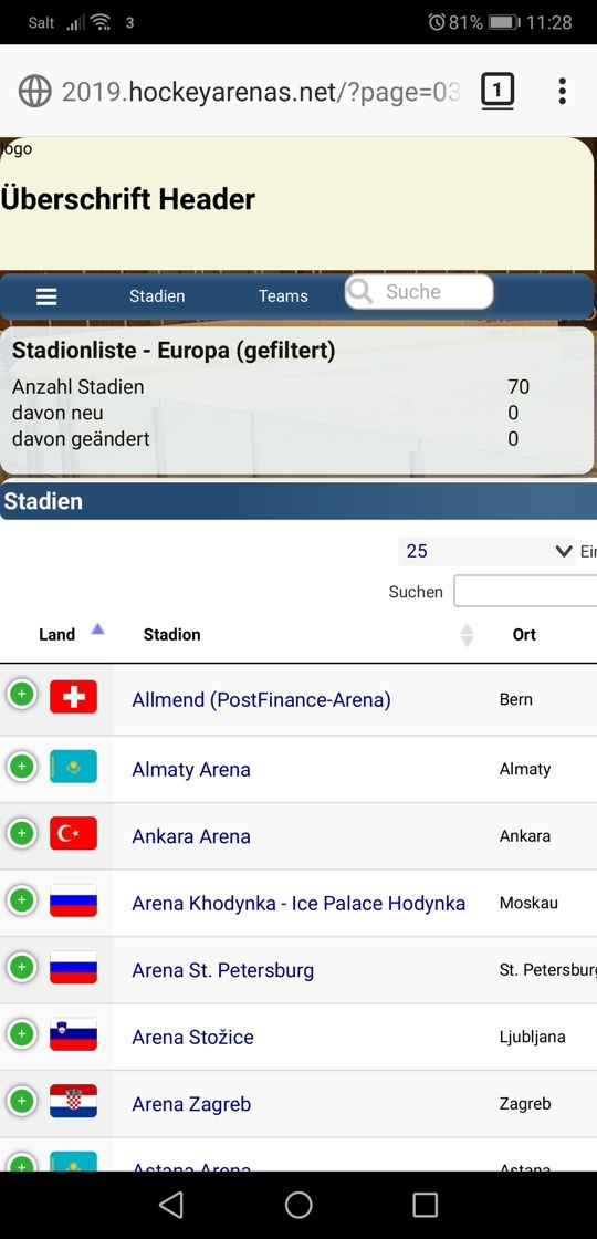
Chrome full page on Huawei H20(Chrome ver 75.0.3770.143)

Firefox full page on Huawei H20 (Firefox ver 68.0)

Same result on Windows 10 with the same browsers.
Cheers,
rge75
Interestingly this appears to be an issue with the grid layout. If you disable
griddisplay, it works perfectly. I'm not yet clear if this is an issue in Firefox or in Responsive though. More research will be required on my part, so I've logged a local bug for this.Allan
Hi @allan
Thank you. Yes, I also noticed that it works fine without grid. Hopefully there's a way to fix it.
The problem with my page is that I can't disable the grid (can't achieve the same layout with flex).
PS Keep on the good work. The plugin itself really is awesome and exactly what I was looking for.
Just wanted to mention that I did a workaround by using flex for the mobile version (I noticed that I only need grid for the bigger/desktop breakpoints). No issues with flex.
@allan
Unfortunately I encountered other issues with DataTables even w/o Flex, but I'll have to do further investigations. I can create a testpage again if needed. With Firefox (and IE) DataTable won't have the correct size as seen here
http://2019.hockeyarenas.net/?page=0600
and here
http://2019.hockeyarenas.net/?page=0700
If I remove the display: flex in the css for the <main> element, it seems to work - but I need the flex in this element with flex due to other elements.
Chrome and Edge will display the page correctly if the browser size is shrinked to the minimum.
Hi,
Another test page would be welcome.
Thanks,
Allan
@allen
Here is the test page for the flex version:
http://2019.hockeyarenas.net/DataTableFlex.html
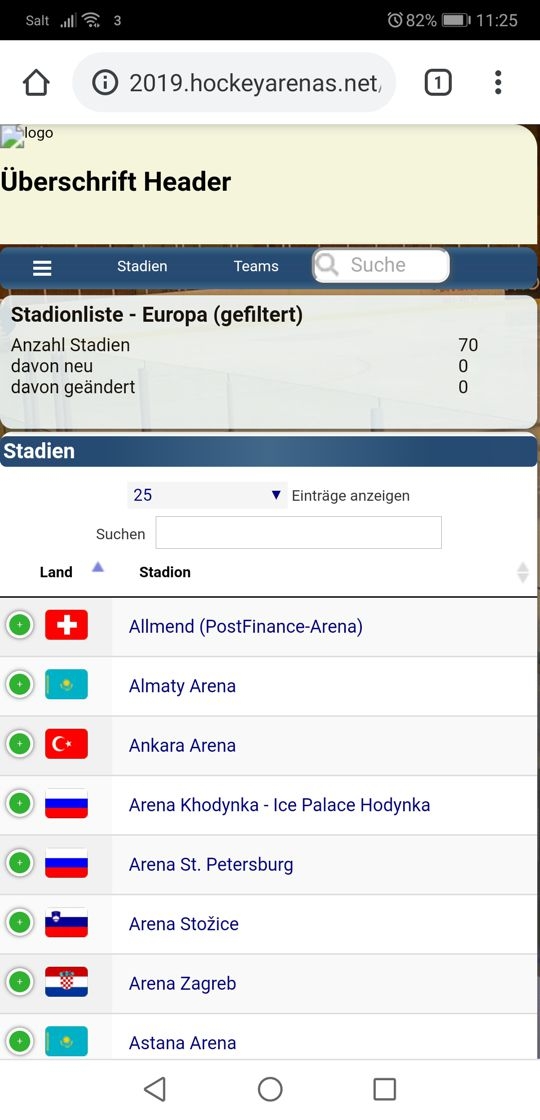
As you can see, the DataTable will be wider than the 100% bar on the top (h1 element). Tested on Windows 10 with Firefox 68.0.1 (64-bit)
When you remove the display: flex entry from main, it seems to work fine.
HTML file (same as before, but stylesheet changed to style_v2_datatables_test2.css)
css File (removed Grid but added display:flex and flex-wrap:wrap to main element.
@allan Sorry, I tagged allen instead of allan in my previous post.
Thanks! I'm going to be looking into a few Responsive issues for its next release soon.
Allan
@allan Just for my planing (go line of my website), what time horizon are we talking about for the next DataTable release? Within the next 2 months? Im of course willing to test the new release. Since my page is not go-live yet, I could also install a beta-release.
Before the end of August. The nightly page includes all of the software in its latest state.
Allan
@allan I noticed that when using "display compact", its working a lot better. There are still a few minor sites where the datatable is too wide (or too small), but overall, it's a lot better. Maybe this info is of some useage for debugging the issue.
Interesting. Possibly its moving it out of flex grid mode, or triggering something else in Firefox. Thanks for the info.
Allan
@allan I'm sorry, I think it's the same. I was only watching on the mobile and the mobile screen is "wider" than the minimum size on the destop. So disregard my previous statement about the "display compact". It doesn't make a difference whether it's "display" or "display compact".
@allan Any news on this matter? I tested the current nightly files, but unfortunately it's still the same issue.
Apologies no. I've not had a chance to look into the Responsive issues yet. I'll post back here when I've done so.
Allan
Looks like I simply have to go online with the "bug" atm in that case.... hopefully you'll find the time to look into it this year. It doesn't look great if the table is wider than the actual layout of the page.
I've had a similar problem when using datatables in a css grid and the cell had a width of "auto", using "minmax(0, auto)" instead of "auto" for the column-width solved it.
Thanks for the information. I'm not using minmax in my css though. I even have the issue with flex. Glad it's working for you :-)
I really hope the devs will find the time to look into it once.
minmax was the solution, not the problem.
Thanks for the hint, but I'm not sure where you're using the minmax in the css? What element/class? Maybe you can do a short copy/past of the css-section?
I had this same problem. Grid does not seem to work with datatables. I solved it by using a bootstrap container inside the grid item.
Thanks @bidon2, your minmax solution worked perfectly... no need for a bootstrap container.