Datatable formatting issues on iPad portrait layout
Datatable formatting issues on iPad portrait layout
 Caliweedjobs
Posts: 10Questions: 3Answers: 0
Caliweedjobs
Posts: 10Questions: 3Answers: 0
Hi,
I'm using datatables in a job board. The job board is a python flask web app that uses bootstrap 4, if that matters to anyone.
I'm seeing some formatting issues when viewing the datatable on my iPad on portrait mode.
The first issue is the search bar is pushing into the column to the right. This is not an issue on larger screens, where there is more space, or smaller screens, where that 2nd column to the right is pushed below the data table.
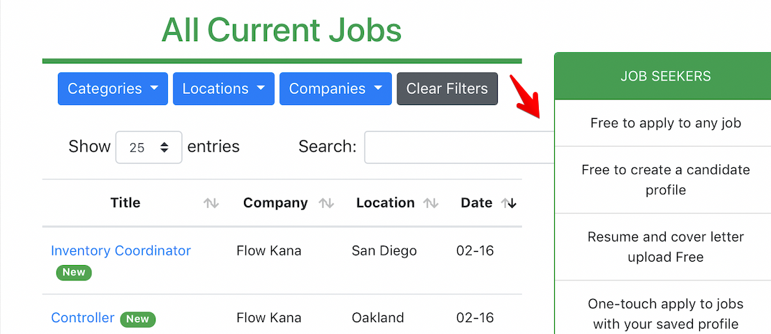
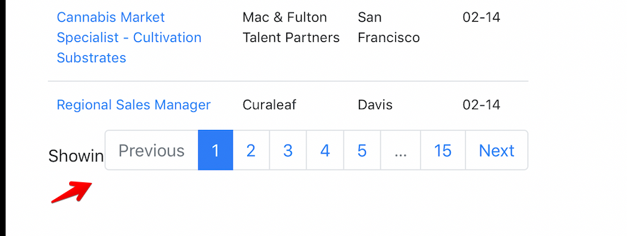
The 2nd issue is the pagination info, for lack of a better term. The page links are getting pushed on top of the text which tells you which rows you are looking at. (i.e. Showing 25 of 100 rows)
Can anyone help with some specific guidance? I ask for specificity because I'm a beginner and a tip like, 'try CSS' is not quite helpful enough.
Thank you! -Ian
Answers
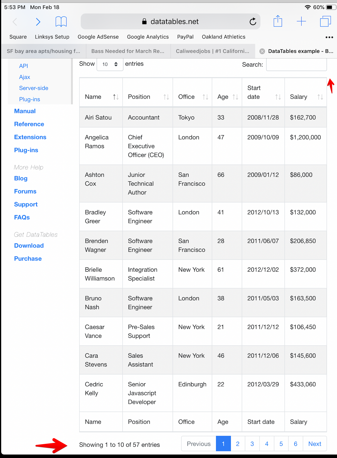
Does this page work for you on your IPAD?
https://datatables.net/examples/styling/bootstrap4.html
Likely the problem is CSS related. Without a link to your page or a test case its nearly impossible to troubleshoot as its specific to your environment.
https://datatables.net/manual/tech-notes/10#How-to-provide-a-test-case
Maybe setting the
domoption based on the BS4 styling example might help.Kevin
Hi @kthorngren, thanks for the reply, the example page you sent looks perfect on my ipad, see screenshot, however my datatable has only 4 columns on ipad, and this example has 6, so it's not an apples to apples comparison:
I don't know if it's practical to provide a test case given how my web app is set up, but i should have provided a link to the page with the datatable earlier, www.caliweedjobs.com.
The link to the Dom styling could help, I do recognize the bootstrap breakpoints in the BS4 styling section, but I don't know what the name of the elements are (pagination text footer?) so it's hard to search, plus I don't want to affect anything else about the table, everything else looks great.
I started a test case with your source code but it seems to display ok. It's missing the "JOB SEEKERS" section to the right in your screenshot. Could be something with that is causing the problem.
https://jsfiddle.net/c0oa39ky/
Someone more CSS savvy than me might be able to find the issue in your page. Or you can try updating the test case to see when the issue appears.
Kevin
No the column with the job seeker window is there to the right in your JSFiddle, you just have to widen your screen.
Same issue is happening in the JSFiddle along the bottom with the pagination though, it looks good greater than 1200px wide, and less than 770 px wide, but in between 770 and 1200px the text and the pagination tabs overlap.
I wish I knew how to access those components so I could shrink the font, hide, stack, manipulate them somehow.
Kevin - thank you for taking the time to build up the test case!
I've got to confess, I really don't understand why the input element is overflowing there! It has
width: autoand it shouldn't be overflowing. The closest I've come to a solution is to use:I really don't understand why it is overflowing...!
Allan
Thanks for looking at it @allan but if you've provided over 7,000 answers and this one stumps you, I'm not very hopeful!
So there's no way to force the wrapping, or stacking, of the pagination tabs at a specified screen width, even with a media query?
Oh yes, that can be done - this is the default CSS's way of doing that. In Bootstrap 4 you can use a grid along with
domto specify where the collapse should be (-xs for example). You can see that take effect if you reduce the window size enough.What I'm not understanding in this case is why the
inputelement is overflowing - I can't see any reason that it would - it should just reduce in size like it does here. Its like there is a min-width applied to it, but I can't see where!Allan